Diploma Project: Rethinking the Airline Booking Flow
Section 01: The Brief & The Discovery
The Problem: Booking Flows That Lose Users
272
Observations
from
6 Usability Tests
Booking a flight should be simple, yet usability testing on Aer Lingus, Ryanair and British Airways showed how easily users lose their way. Progress bars didn't match the page, baggage options were missed entirely and surprise pop-ups were closed on reflex. Most telling of all, when information wasn't obvious, users blamed themselves rather than the site.
The Solution: A Clear, Linear Booking Flow
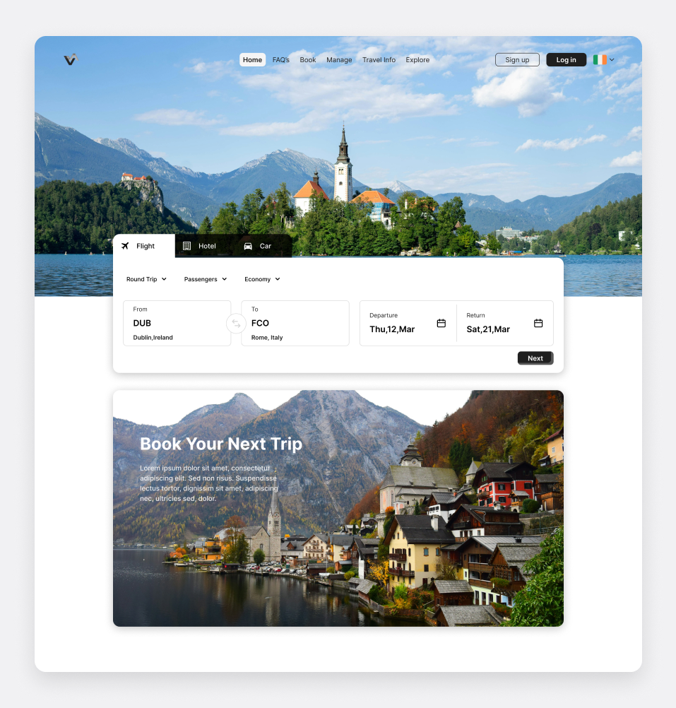
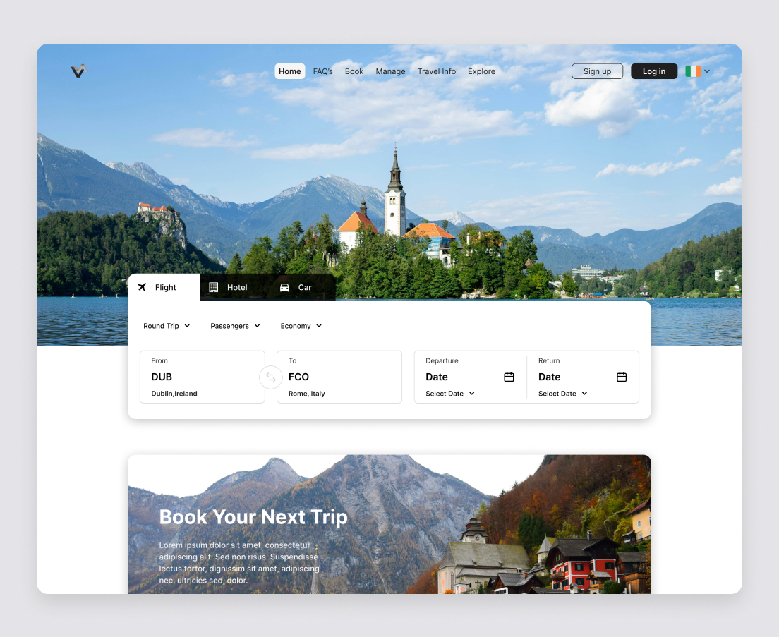
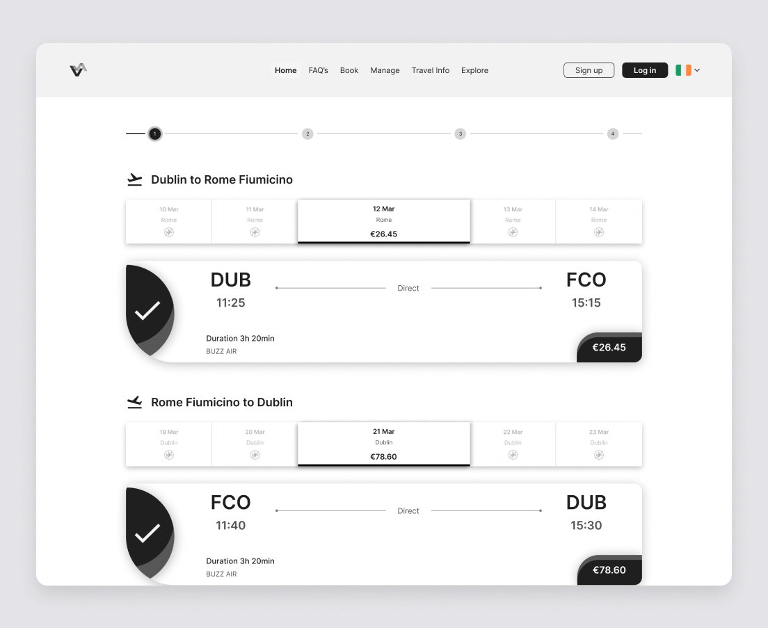
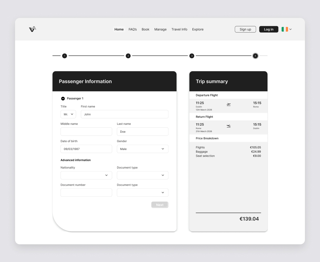
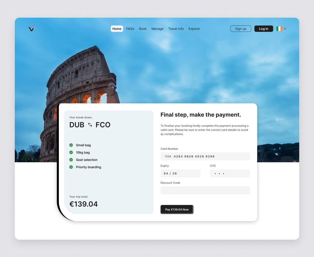
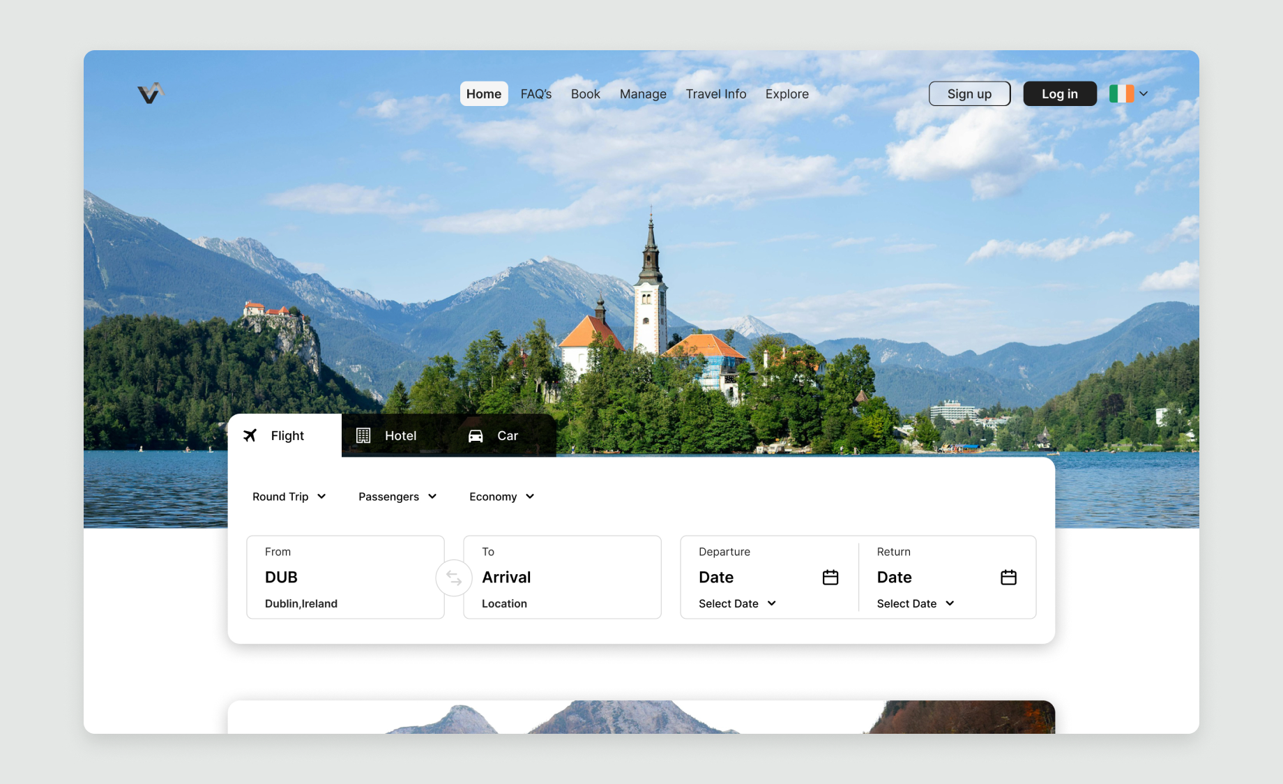
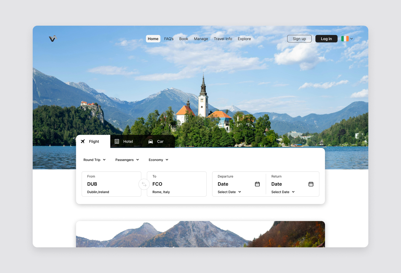
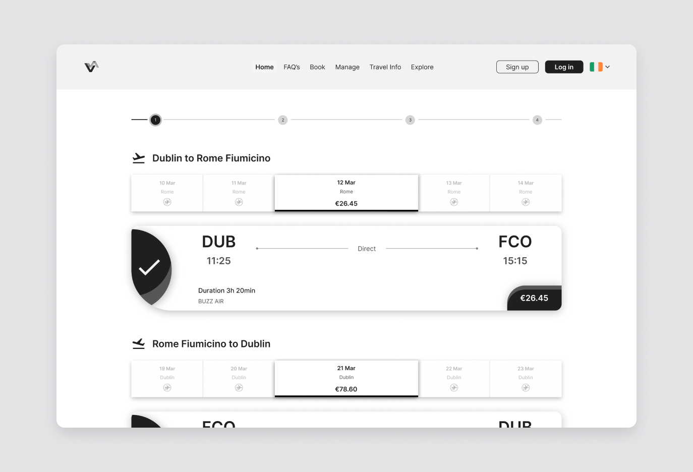
I designed a desktop booking flow for a return trip from Dublin to Rome. Departure is auto-filled from the user's location, a country-by-country destination picker and two-month date picker speed up search, and a four-step progress tracker shows where users are. Flights, seats, bags and passenger details follow in a clear order, with a sticky trip summary keeping the running total visible right up to payment.
The Mission
The goal was twofold: help users book a flight quickly and confidently without feeling tricked, and give the airline a flow that still presents fares, bags, seats and extras as genuine choices rather than obstacles.
Section 02: User Research & Validation
Usability Testing the Competition

85 positive
52 negative
0
30
60
90
0
30
60
90
I ran six usability tests with three participants, all frequent travellers who prefer booking on desktop because it feels safer and less error-prone. Each participant booked a realistic return trip on two airline sites, including Aer Lingus, Ryanair and British Airways, thinking aloud as they went. I logged 272 observations across the sessions.
Affinity Mapping: What Users Showed Me
I grouped every observation into an affinity diagram and tagged each one as positive, negative or acceptable. Auto-fill and clean interfaces built instant trust, but three problems came up again and again:
Baggage causes the most confusion
Users couldn't tell an included 20kg bag from an extra 10kg one.
Extras feel like obstacles
Pop-ups were closed on reflex and add-on pages felt repetitive.
Users lose their place
The progress bar didn't match the page, so users lost track of their step.
Reframing the Flow
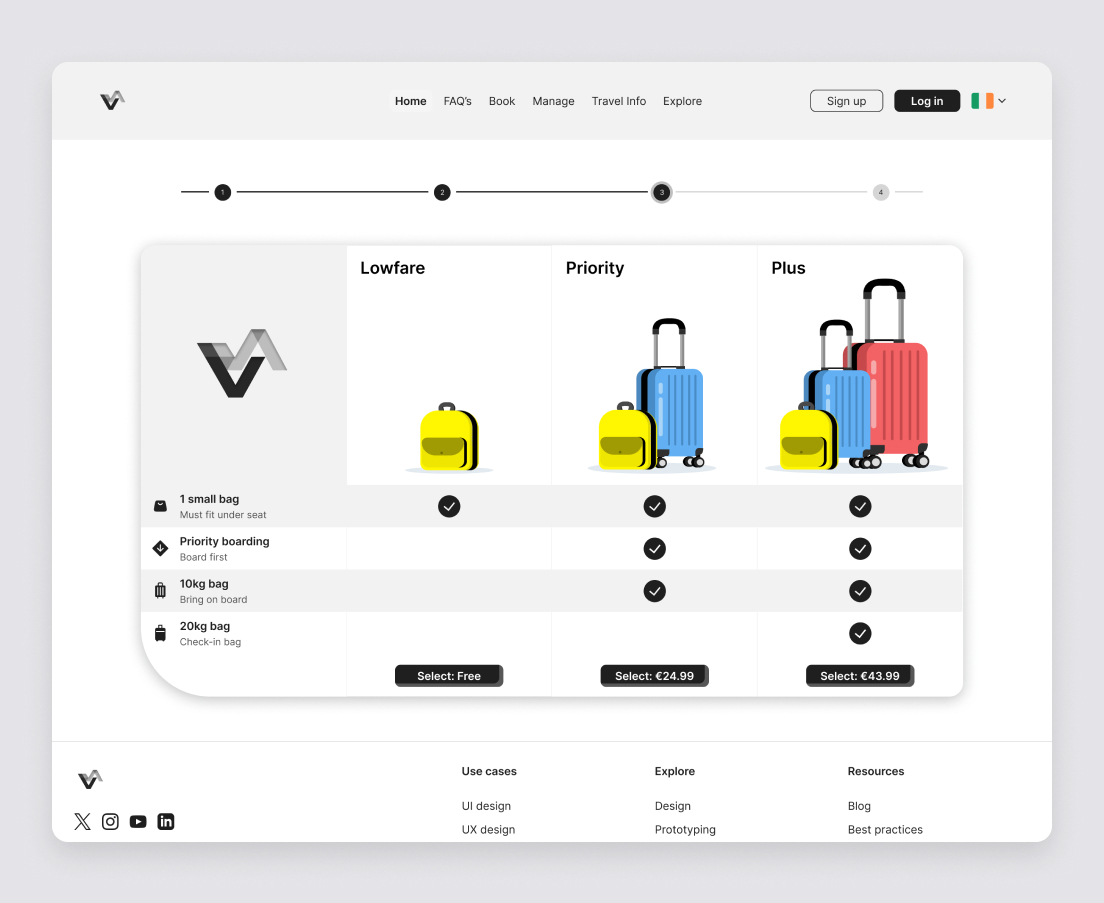
A customer journey map showed that confidence dropped most after flight selection, as users moved into seats, bags and extras. Because users made decisions based on price, I designed the flow around clarity: every option shows its price, each baggage tier shows exactly what's included with colour-coded luggage illustrations, and a sticky trip summary keeps the total in view at every step.
Section 03: Wireframing & Prototyping
Wireframing: Mapping the Flow
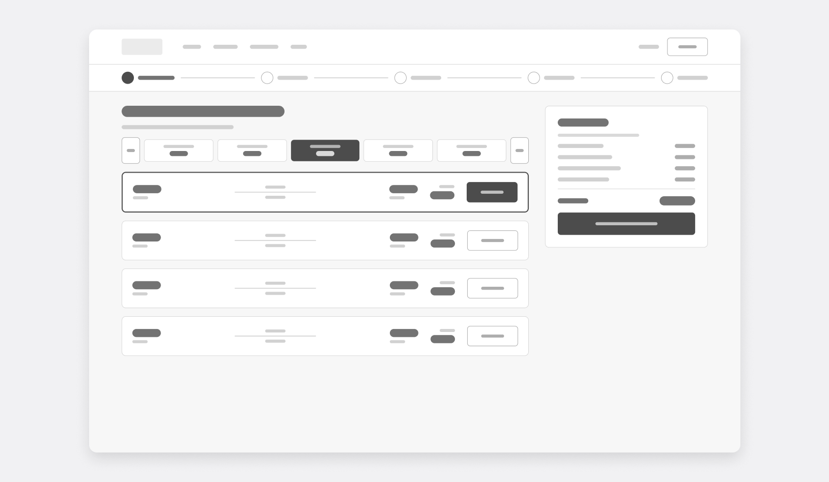
I mapped the full user flow for my scenario, a Dublin to Rome return for one passenger with a 20kg bag, sketched every screen on paper, then turned the sketches into lo-fi wireframes: search, dates, flights, seats, passenger details, bags and payment.
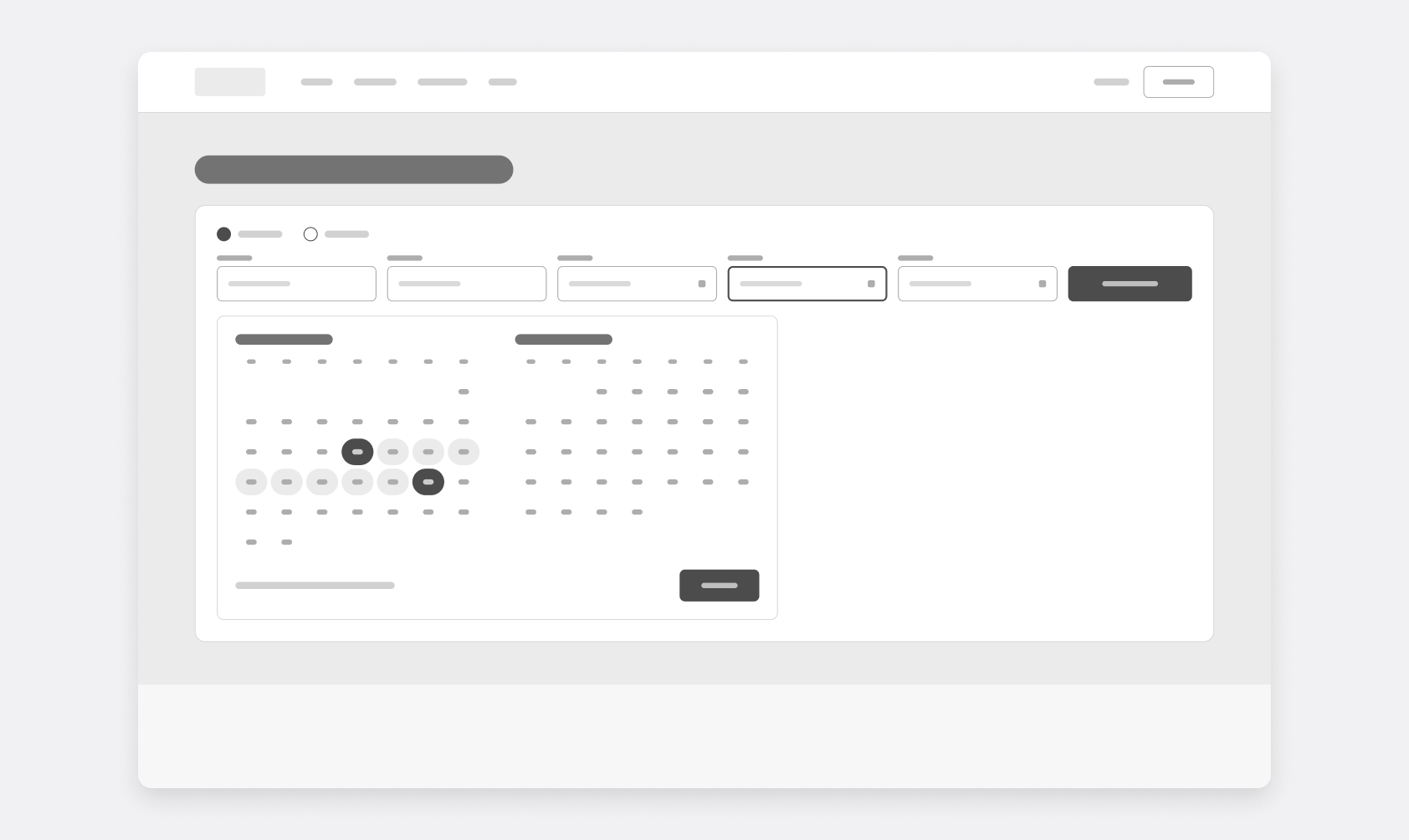
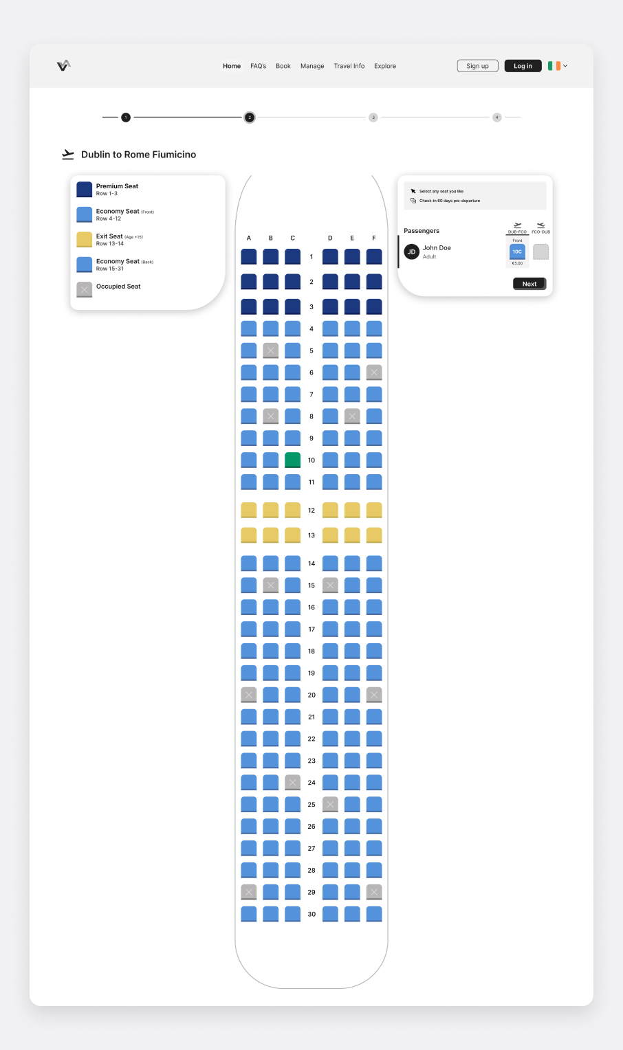
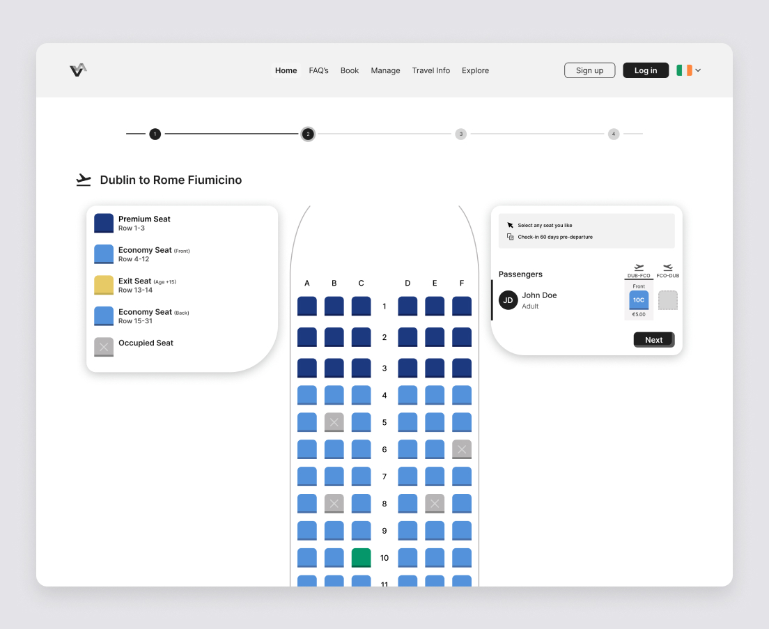
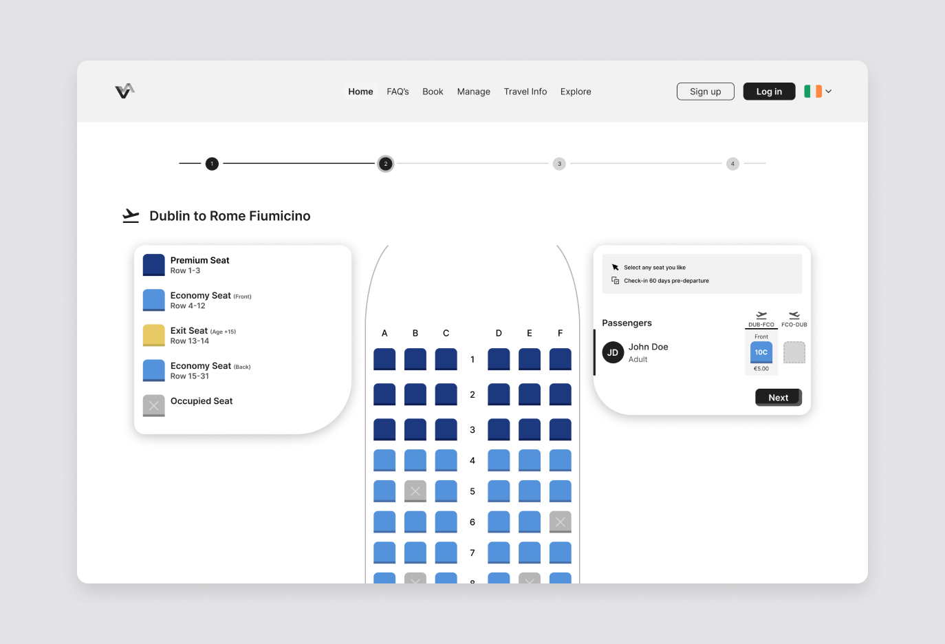
Laying the wireframes side by side showed where the flow could be simplified. The date picker covers two months and moves straight on to the return date, the seat map uses colour for price bands and wing and nose markers for orientation, and the baggage screen offers three clear options with the fare's included bag outlined. Fare and baggage screens were then merged into a single comparison step.
Digital Prototyping: The Interface
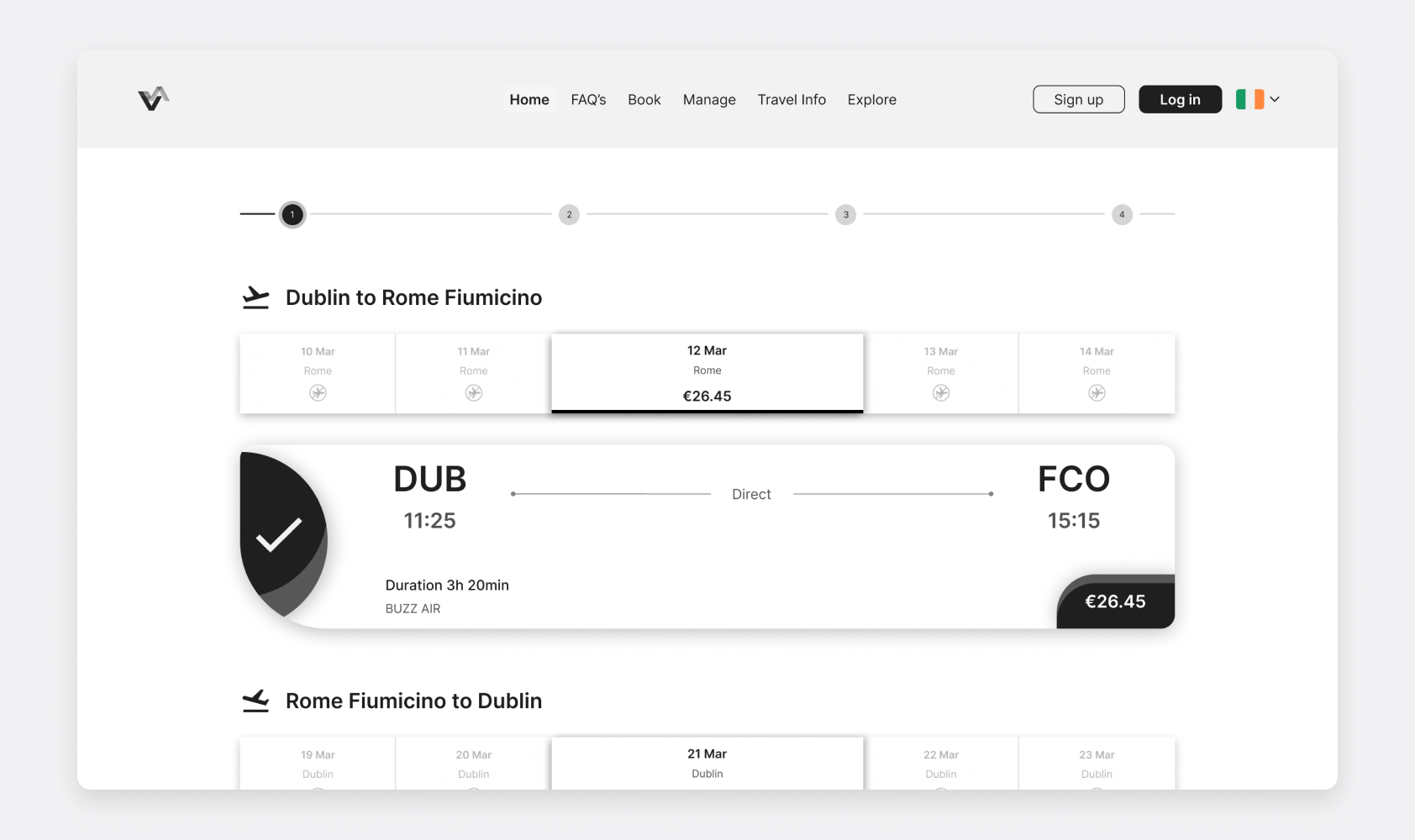
I built the final design as a high-fidelity, interactive prototype in Figma, covering the full journey from search to payment. A four-step progress tracker keeps users oriented, passenger names open inline beneath the chosen flights, the seat map is colour-coded by seat type, and a sticky trip summary keeps the running total in view. I tested it with participants using a task-based script, then annotated every screen for developer handoff.
Section 04: Outcomes & Reflections
Designing for Trust, Not Just Conversion
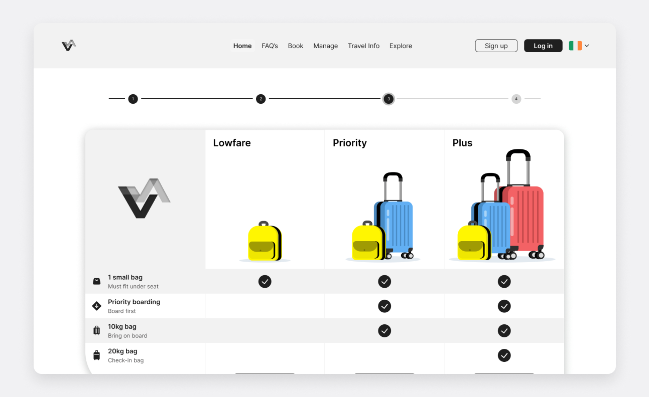
Airlines rely on extras such as bags, seats and fast track for revenue, so removing them was never an option. Testing showed users don't mind extras; they mind being ambushed by them. By presenting each one at the right step, with its price shown and a clear way to skip it, the flow still offers every upsell as a choice rather than a trap.
What Testing Taught Me
Users rarely blame the interface. When information wasn't obvious, participants assumed they had made the mistake. Testing the prototype proved how much small details matter: one participant missed the passenger number selector entirely, so the flow now takes users straight to it, and the main button was relabelled from “Next” to “Search” to match what users expected.
Final Thoughts
This project taught me that good UX is rarely about adding features. It is about removing doubt. Following a structured process from research to prototype kept every decision grounded in real user behaviour, and showed me how much trust can be won or lost in a single step of a flow.
Diploma Project: Rethinking the Airline Booking Flow
Section 01: The Brief & The Discovery
The Problem: Booking Flows That Lose Users
01
272
Observations
from
6 Usability Tests
Booking a flight should be simple, yet usability testing on Aer Lingus, Ryanair and British Airways showed how easily users lose their way. Progress bars didn't match the page, baggage options were missed entirely and surprise pop-ups were closed on reflex. Most telling of all, when information wasn't obvious, users blamed themselves rather than the site.
The Solution: A Clear, Linear Booking Flow
02
I designed a desktop booking flow for a return trip from Dublin to Rome. Departure is auto-filled from the user's location, a country-by-country destination picker and two-month date picker speed up search, and a four-step progress tracker shows where users are. Flights, seats, bags and passenger details follow in a clear order, with a sticky trip summary keeping the running total visible right up to payment.
The Mission
The goal was twofold: help users book a flight quickly and confidently without feeling tricked, and give the airline a flow that still presents fares, bags, seats and extras as genuine choices rather than obstacles.
Section 02: User Research & Validation
Usability Testing the Competition
01

85 positive
52 negative
0
30
60
90
0
30
60
90
I ran six usability tests with three participants, all frequent travellers who prefer booking on desktop because it feels safer and less error-prone. Each participant booked a realistic return trip on two airline sites, including Aer Lingus, Ryanair and British Airways, thinking aloud as they went. I logged 272 observations across the sessions.
Affinity Mapping: What Users Showed Me
I grouped every observation into an affinity diagram and tagged each one as positive, negative or acceptable. Auto-fill and clean interfaces built instant trust, but three problems came up again and again:
Baggage causes the most confusion
Users couldn't tell an included 20kg bag from an extra 10kg one.
Extras feel like obstacles
Pop-ups were closed on reflex and add-on pages felt repetitive.
Users lose their place
The progress bar didn't match the page, so users lost track of their step.
Reframing the Flow
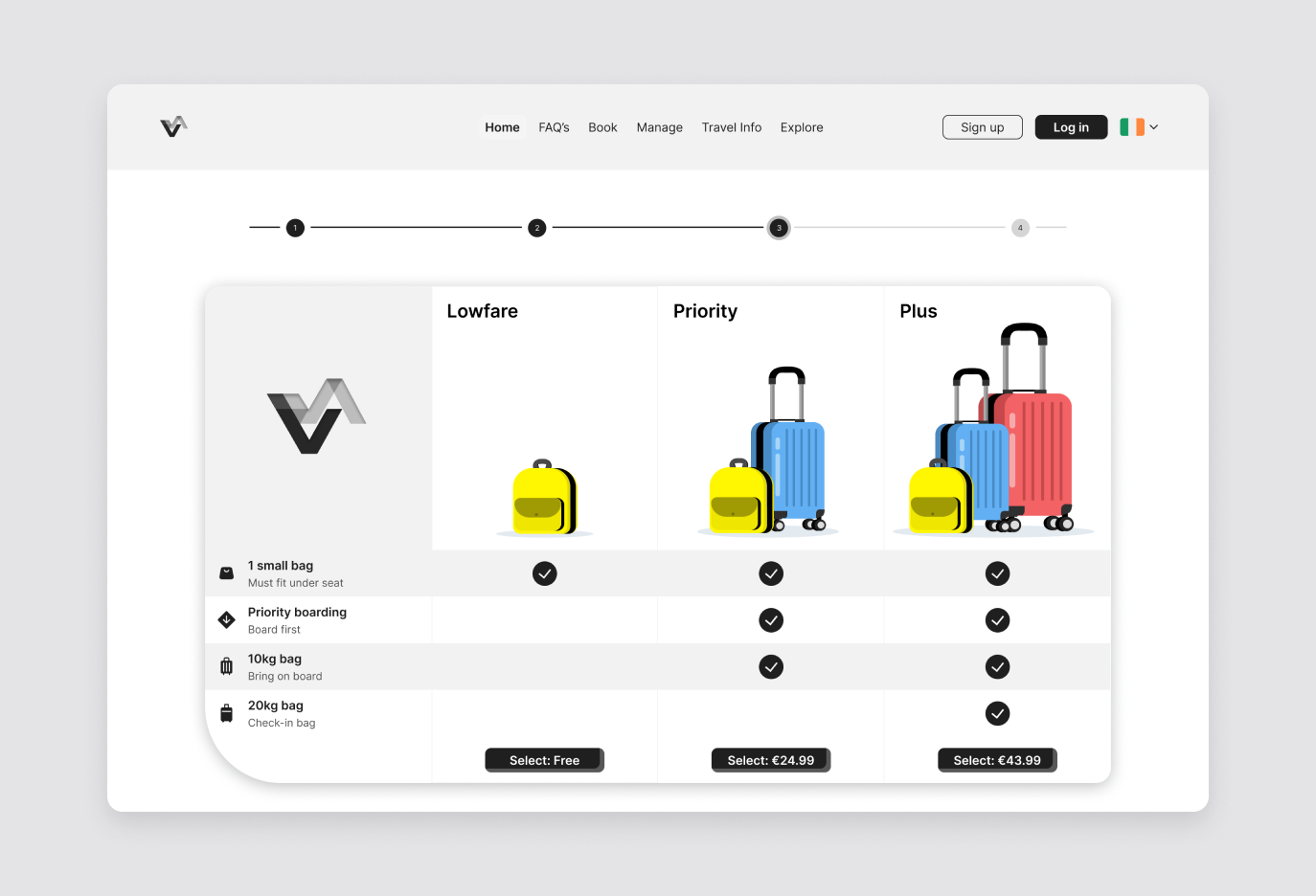
A customer journey map showed that confidence dropped most after flight selection, as users moved into seats, bags and extras. Because users made decisions based on price, I designed the flow around clarity: every option shows its price, each baggage tier shows exactly what's included with colour-coded luggage illustrations, and a sticky trip summary keeps the total in view at every step.
Section 03: Wireframing & Prototyping
Wireframing: Mapping the Flow
01
I mapped the full user flow for my scenario, a Dublin to Rome return for one passenger with a 20kg bag, sketched every screen on paper, then turned the sketches into lo-fi wireframes: search, dates, flights, seats, passenger details, bags and payment.
02
Laying the wireframes side by side showed where the flow could be simplified. The date picker covers two months and moves straight on to the return date, the seat map uses colour for price bands and wing and nose markers for orientation, and the baggage screen offers three clear options with the fare's included bag outlined. Fare and baggage screens were then merged into a single comparison step.
Digital Prototyping: The Interface
03
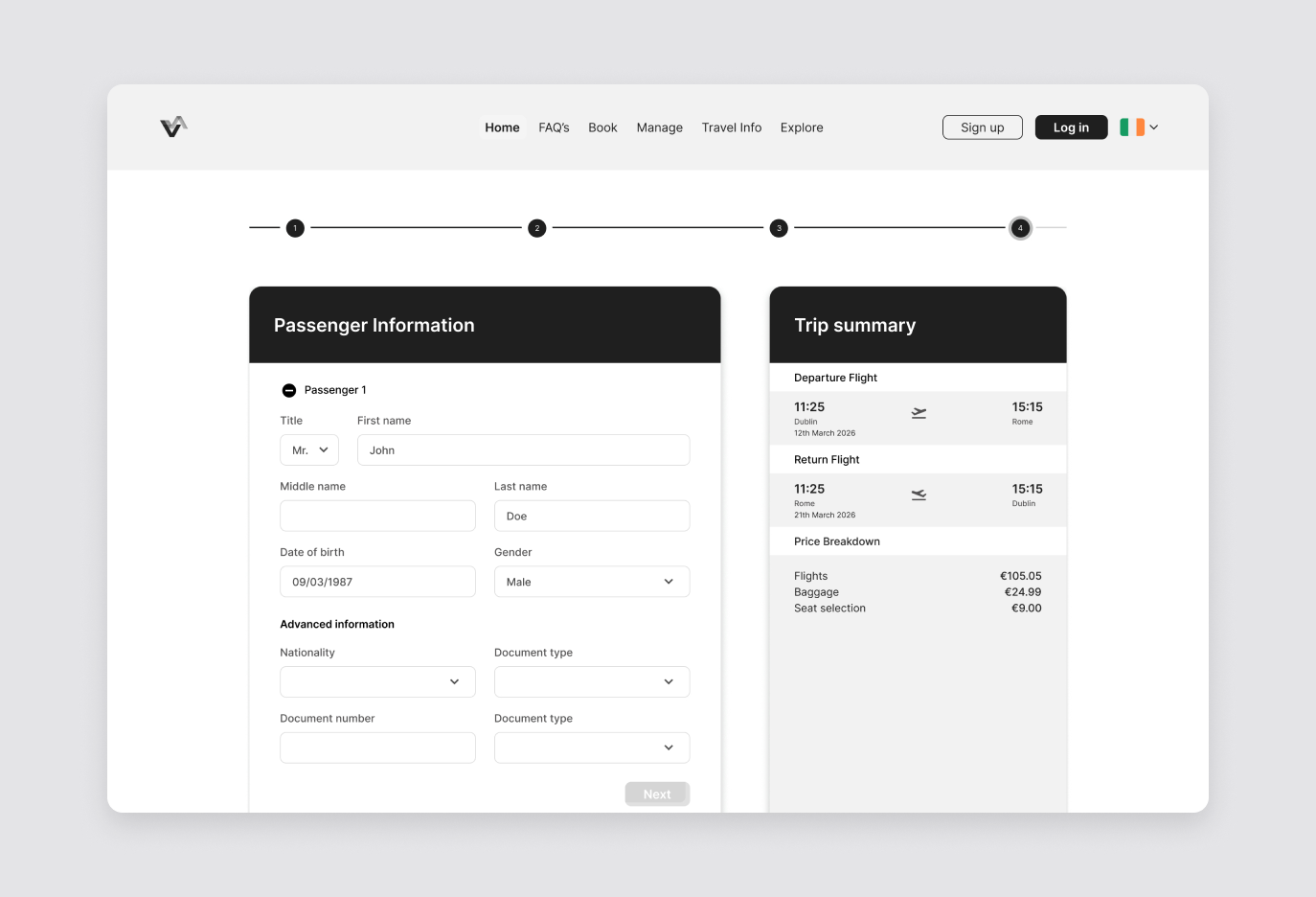
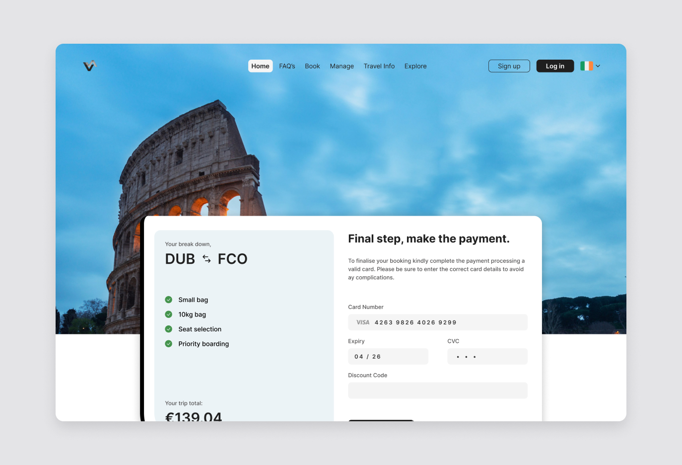
I built the final design as a high-fidelity, interactive prototype in Figma, covering the full journey from search to payment. A four-step progress tracker keeps users oriented, passenger names open inline beneath the chosen flights, the seat map is colour-coded by seat type, and a sticky trip summary keeps the running total in view. I tested it with participants using a task-based script, then annotated every screen for developer handoff.
Section 04: Outcomes & Reflections
Designing for Trust, Not Just Conversion
01
Airlines rely on extras such as bags, seats and fast track for revenue, so removing them was never an option. Testing showed users don't mind extras; they mind being ambushed by them. By presenting each one at the right step, with its price shown and a clear way to skip it, the flow still offers every upsell as a choice rather than a trap.
What Testing Taught Me
Users rarely blame the interface. When information wasn't obvious, participants assumed they had made the mistake. Testing the prototype proved how much small details matter: one participant missed the passenger number selector entirely, so the flow now takes users straight to it, and the main button was relabelled from “Next” to “Search” to match what users expected.
Final Thoughts
This project taught me that good UX is rarely about adding features. It is about removing doubt. Following a structured process from research to prototype kept every decision grounded in real user behaviour, and showed me how much trust can be won or lost in a single step of a flow.
Diploma Project: Rethinking the Airline Booking Flow
Section 01: The Brief & The Discovery
The Problem: Booking Flows That Lose Users
Booking a flight should be simple, yet usability testing on Aer Lingus, Ryanair and British Airways showed how easily users lose their way. Progress bars didn't match the page, baggage options were missed entirely and surprise pop-ups were closed on reflex. Most telling of all, when information wasn't obvious, users blamed themselves rather than the site.
The Solution: A Clear, Linear Booking Flow
I designed a desktop booking flow for a return trip from Dublin to Rome. Departure is auto-filled from the user's location, a country-by-country destination picker and two-month date picker speed up search, and a four-step progress tracker shows where users are. Flights, seats, bags and passenger details follow in a clear order, with a sticky trip summary keeping the running total visible right up to payment.
The Mission
The goal was twofold: help users book a flight quickly and confidently without feeling tricked, and give the airline a flow that still presents fares, bags, seats and extras as genuine choices rather than obstacles.
272
Observations
from
6 Usability Tests
Section 02: User Research & Validation
Usability Testing the Competition
I ran six usability tests with three participants, all frequent travellers who prefer booking on desktop because it feels safer and less error-prone. Each participant booked a realistic return trip on two airline sites, including Aer Lingus, Ryanair and British Airways, thinking aloud as they went. I logged 272 observations across the sessions.
Affinity Mapping: What Users Showed Me
I grouped every observation into an affinity diagram and tagged each one as positive, negative or acceptable. Auto-fill and clean interfaces built instant trust, but three problems came up again and again:
Baggage causes the most confusion
Users couldn't tell an included 20kg bag from an extra 10kg one.
Extras feel like obstacles
Pop-ups were closed on reflex and add-on pages felt repetitive.
Users lose their place
The progress bar didn't match the page, so users lost track of their step.
Reframing the Flow
A customer journey map showed that confidence dropped most after flight selection, as users moved into seats, bags and extras. Because users made decisions based on price, I designed the flow around clarity: every option shows its price, each baggage tier shows exactly what's included with colour-coded luggage illustrations, and a sticky trip summary keeps the total in view at every step.
85 positive
52 negative
0
30
60
90
0
30
60
90
Affinity Diagram
Tagged observations
Users blamed themselves, not the site.
Section 03: Wireframing & Prototyping
Wireframing: Mapping the Flow
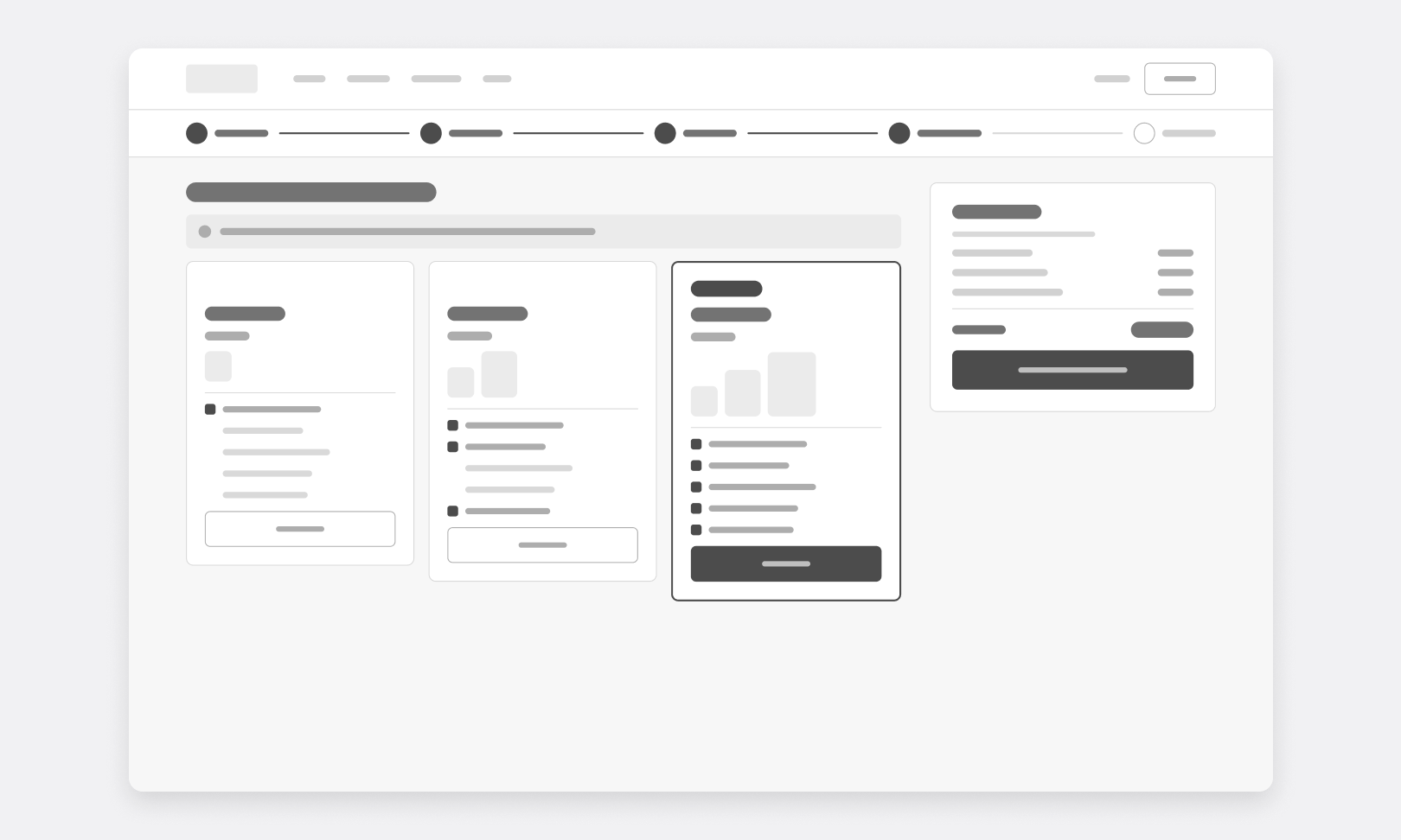
I mapped the full user flow for my scenario, a Dublin to Rome return for one passenger with a 20kg bag, sketched every screen on paper, then turned the sketches into lo-fi wireframes: search, dates, flights, seats, passenger details, bags and payment.
Laying the wireframes side by side showed where the flow could be simplified. The date picker covers two months and moves straight on to the return date, the seat map uses colour for price bands and wing and nose markers for orientation, and the baggage screen offers three clear options with the fare's included bag outlined. Fare and baggage screens were then merged into a single comparison step.
Digital Prototyping: The Interface
I built the final design as a high-fidelity, interactive prototype in Figma, covering the full journey from search to payment. A four-step progress tracker keeps users oriented, passenger names open inline beneath the chosen flights, the seat map is colour-coded by seat type, and a sticky trip summary keeps the running total in view. I tested it with participants using a task-based script, then annotated every screen for developer handoff.
Section 04: Outcomes & Reflections
Designing for Trust, Not Just Conversion
Airlines rely on extras such as bags, seats and fast track for revenue, so removing them was never an option. Testing showed users don't mind extras; they mind being ambushed by them. By presenting each one at the right step, with its price shown and a clear way to skip it, the flow still offers every upsell as a choice rather than a trap.
What Testing Taught Me
Users rarely blame the interface. When information wasn't obvious, participants assumed they had made the mistake. Testing the prototype proved how much small details matter: one participant missed the passenger number selector entirely, so the flow now takes users straight to it, and the main button was relabelled from “Next” to “Search” to match what users expected.
Final Thoughts
This project taught me that good UX is rarely about adding features. It is about removing doubt. Following a structured process from research to prototype kept every decision grounded in real user behaviour, and showed me how much trust can be won or lost in a single step of a flow.