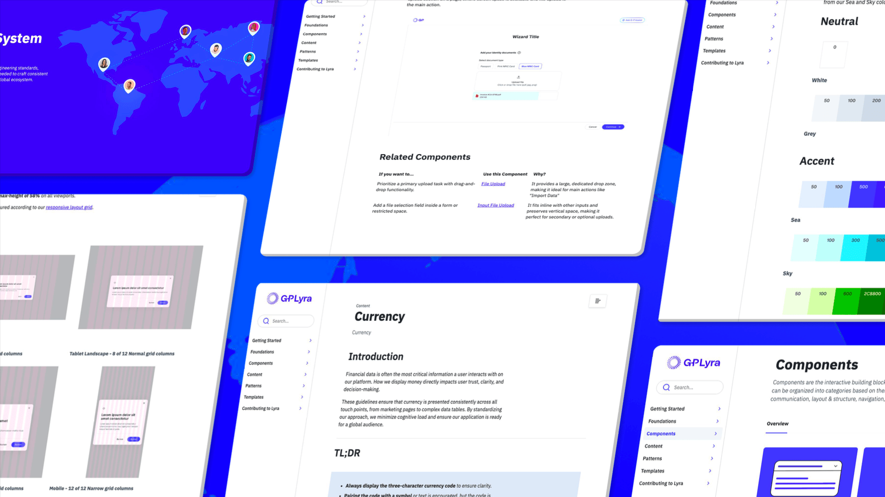
Systematizing the System: The G-P Lyra Context Block
My Role
UX Design Intern
Team
Design System
Timeline
10 Weeks
Tools
Figma, Story Book
Platform
Zero Height
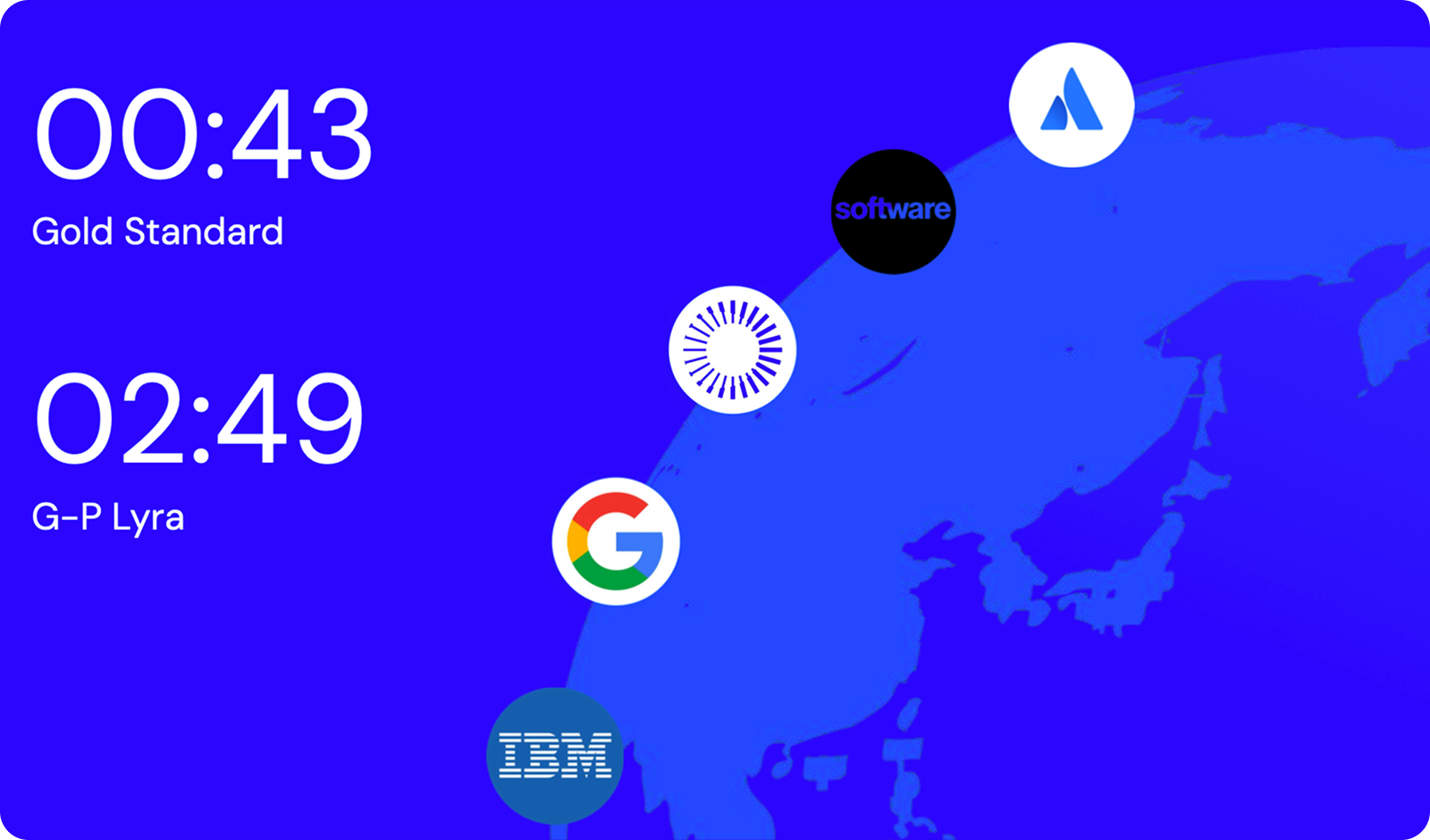
TL;DR: I led a system-wide architectural realignment of G-P Lyra's documentation, replacing fragmented tabs with a unified "Context Block" single-page structure. This overhauled the discovery path for both designers and developers, dropping average search times from an obsolete 2:49 down to a gold-standard 0:46.
Section 01: The Problem
The Two-Minute Frustration Ceiling
A design system is only as effective as its documentation. Internal research revealed that G-P team members had a strict "frustration ceiling": if they could not find an answer within two minutes, they abandoned the official documentation.
The Baseline Failure: Task-based audits and a RAG (Red, Amber, Green) analysis of our existing documentation revealed mass inconsistency and information scarcity.
Tooltip
A tooltip briefly describes an interactive element on mouse hover or keyboard focus.
Examples
Code
Usage
Changelog
Default
Use the default tooltip to display brief, helpful information when a person hovers over a target element. The default tooltip will:
appear and disappear after a short delay.
•
remain visible if someone briefly moves their mouse off and back onto the target.
•
disappear immediately if someone hovers over or focuses on another element with a tooltip, or if they scroll the page.
•
Tooltip content will wrap at 240px to maintain readability.
Single line example
Multi-line example

Styles

Copy code

Edit in code sandbox

import React from 'react';
import Button from '@atlaskit/button/default/button';
import { Inline } from '@atlaskit/primitives/compiled';
import Tooltip from '@atlaskit/tooltip/Tooltip';
export default function TooltipDefaultExample(): React.JSX.Element {
return (
<Inline space="space.100">
<Tooltip content="This is a tooltip">
{(tooltipProps) => (
<Button appearance="primary" {...tooltipProps}>
Single line example
</Button>
)}
</Tooltip>
<Tooltip content="This is a tooltip with a longer message that will wrap at 240px to maintain readability.">
{(tooltipProps) => (
<Button appearance="primary" {...tooltipProps}>
Multi-line example
</Button>
)}
</Tooltip>
</Inline>
);
}
Show more

With keyboard shortcut
Use the
shortcut
prop to display a keyboard shortcut in the tooltip. Keys will be displayed as individual keyboard key segments below the tooltip content.
Keyboard shortcuts in tooltips are hidden from screen readers, so always provide them in another way, such as a panel or dialog. This ensures everyone can discover and use shortcuts, no matter how they navigate.
Single line example
Multi-line example

Styles

Copy code

Edit in code sandbox

import React from 'react';
import Button from '@atlaskit/button/default/button';
import { Inline } from '@atlaskit/primitives/compiled';
import Tooltip from '@atlaskit/tooltip/Tooltip';
export default function TooltipKeyboardShortcutExample(): React.JSX.Element {
return (
<Inline space="space.100">
<Tooltip content="This is a tooltip" shortcut={['Ctrl', '[']}>
{(tooltipProps) => (
<Button appearance="primary" {...tooltipProps}>
Single line example
</Button>
)}
</Tooltip>
<Tooltip
content="This is a tooltip with a longer message that will wrap at 240px to maintain readability."
shortcut={['Ctrl', '[']}
>
{(tooltipProps) => (
<Button appearance="primary" {...tooltipProps}>
Multi-line example
</Button>
)}
</Tooltip>
</Inline>
);
}
Show more

Positioning
Relative to target
Use the
position
prop to specify where the tooltip appears relative to its target:
top
,
right
,
left
, or
bottom
.
Set
position="auto"
so the tooltip automatically shows on the side with the most available space.
•
If you don’t set a position, the tooltip defaults to
bottom
.
•
If the preferred side would cause it to overflow the screen, the tooltip will automatically adjust its position.
•
top
top-start
top-end
bottom
bottom-start
bottom-end
right
right-start
right-end
left
left-start
left-end
auto
auto-start
auto-end

Styles

Copy code

Edit in code sandbox

import React from 'react';
import Button from '@atlaskit/button/default/button';
import { cssMap } from '@atlaskit/css';
import { placements } from '@atlaskit/popper/main';
import { Box } from '@atlaskit/primitives/compiled';
import { token } from '@atlaskit/tokens';
import Tooltip from '@atlaskit/tooltip/Tooltip';
const placementGridPositions = cssMap({
'top-start': {
gridColumn: 2,
gridRow: 1,
},
top: {
gridColumn: 3,
gridRow: 1,
},
'top-end': {
gridColumn: 4,
gridRow: 1,
},
'bottom-start': {
gridColumn: 2,
gridRow: 5,
},
bottom: {
gridColumn: 3,
gridRow: 5,
},
'bottom-end': {
gridColumn: 4,
gridRow: 5,
},
'right-start': {
gridColumn: 5,
gridRow: 2,
},
right: {
gridColumn: 5,
gridRow: 3,
},
'right-end': {
gridColumn: 5,
gridRow: 4,
},
'left-start': {
gridColumn: 1,
gridRow: 2,
},
left: {
gridColumn: 1,
gridRow: 3,
},
'left-end': {
gridColumn: 1,
gridRow: 4,
},
'auto-start': {
gridColumn: 3,
gridRow: 2,
},
auto: {
gridColumn: 3,
gridRow: 3,
},
'auto-end': {
gridColumn: 3,
gridRow: 4,
},
});
const buttonGridStyles = cssMap({
root: {
display: 'grid',
gap: token('space.100'),
gridTemplate: 'repeat(5, 1fr) / repeat(5, 1fr)',
justifyItems: 'stretch',
},
});
const PositionExample = (): React.JSX.Element => {
return (
<Box xcss={buttonGridStyles.root}>
{placements.map((placement) => (
<Box key={placement} xcss={placementGridPositions[placement]}>
<Tooltip position={placement} content={placement}>
{(tooltipProps) => (
<Button {...tooltipProps} shouldFitContainer>
{placement}
</Button>
)}
</Tooltip>
</Box>
))}
</Box>
);
};
export default PositionExample;
Show more

Relative to mouse pointer
Positioning the tooltip near the mouse pointer, rather than the target, is helpful in scenarios where the tooltip may be visually disconnected from where someone hovers.
Examples include hovering on large target areas, such as panel resizers, or when someone hovers on an element while zoomed in on part of the screen where the tooltip doesn’t show.
To display the tooltip next to the mouse pointer (instead of the target element), set
position="mouse"
.
•
Further adjust the tooltip’s placement relative to the mouse by using the
mousePosition
property.
•
For keyboard users, the tooltip will always appear below (
bottom
position) the target element by default.
•
Resize me! Hover or focus on the right edge

Styles

Copy code

Edit in code sandbox

import { type CSSProperties, useRef, useState } from 'react';
import { cssMap, jsx } from '@compiled/react';
import {
PanelSplitter,
PanelSplitterProvider,
type ResizeBounds,
} from '@atlaskit/navigation-system/layout/panel-splitter';
import { token } from '@atlaskit/tokens';
const widthVar = '--panel-width';
const resizingCssVar = '--panel-splitter-resizing';
const styles = cssMap({
root: {
width: `var(${resizingCssVar}, var(${widthVar}))`,
height: '200px',
position: 'relative',
backgroundColor: token('color.background.accent.gray.subtlest'),
borderInlineEnd: `${token('border.width')} solid ${token('color.border')}`,
paddingBlockStart: token('space.100'),
paddingInlineEnd: token('space.100'),
paddingBlockEnd: token('space.100'),
paddingInlineStart: token('space.100'),
},
});
function getResizeBounds(): ResizeBounds {
return { min: '150px', max: '400px' };
}
const PanelSplitterWithTooltipAndShortcut = (): JSX.Element => {
const panelSplitterParentRef = useRef<HTMLDivElement | null>(null);
const [width, setWidth] = useState(300);
return (
<div
ref={panelSplitterParentRef}
css={styles.root}
style={
{
[widthVar]: `${width}px`,
} as CSSProperties
}
>
Resize me! Hover or focus on the right edge
<br />
<PanelSplitterProvider
panelRef={panelSplitterParentRef}
panelWidth={width}
onCompleteResize={setWidth}
getResizeBounds={getResizeBounds}
resizingCssVar={resizingCssVar}
position="end"
shortcut={['Ctrl', '[']}
>
<PanelSplitter
label="Resize panel"
testId="panel-splitter"
tooltipContent="Collapse panel"
/>
</PanelSplitterProvider>
</div>
);
};
export default PanelSplitterWithTooltipAndShortcut;
Show more

Updating tooltip position
When the content of a tooltip changes due to lazy loading, its position isn't recalculated and the tooltip may become misaligned.
If you need the tooltip to recalculate its position, you can control this manually using the
update
callback provided to the
content
render prop.
Hover and wait — content updates after 2s
Not using the update callback

Styles

Copy code

Edit in code sandbox

import React, { type ReactNode, useEffect, useLayoutEffect, useState } from 'react';
import Button from '@atlaskit/button/default/button';
import { Inline } from '@atlaskit/primitives/compiled';
import Tooltip from '@atlaskit/tooltip/Tooltip';
/**
* Content updates after a timeout only (no click).
* Example was changed from click-to-toggle so that with top-layer (popover="hint"), testing
* doesn't trigger light-dismiss: clicking outside the tooltip closes it, which made the
* update example appear broken. Hover + wait for timeout avoids that.
*/
const CONTENT_UPDATE_DELAY_MS = 2000;
function TooltipContent({ update }: { update?: () => void }): ReactNode {
const [isLoading, setIsLoading] = useState(true);
useEffect(() => {
const id = setTimeout(() => {
setIsLoading(false);
}, CONTENT_UPDATE_DELAY_MS);
return () => clearTimeout(id);
}, []);
useLayoutEffect(() => {
update?.();
}, [isLoading, update]);
return isLoading ? 'Loading...' : 'I am a lazy loaded tooltip, with a lot of content';
}
export default function TooltipUpdateContentExample(): React.JSX.Element {
return (
<Inline space="space.100">
<Tooltip content={({ update }) => <TooltipContent update={update} />}>
{(tooltipProps) => (
<Button {...tooltipProps}>
Hover and wait — content updates after {CONTENT_UPDATE_DELAY_MS / 1000}s
</Button>
)}
</Tooltip>
<Tooltip content={() => <TooltipContent />}>
{(tooltipProps) => <Button {...tooltipProps}>Not using the update callback</Button>}
</Tooltip>
</Inline>
);
}
Show more

Conditional tooltips for truncation
A tooltip can be conditionally shown by leveraging the
canAppear
prop. Use when you want the tooltip to only show when the element content is truncated.
Tooltip shown on this item as it is concatenated
No tooltip shown as this item is not being concatenated

Styles

Copy code

Edit in code sandbox

import { useRef } from 'react';
import { jsx } from '@compiled/react';
import invariant from 'tiny-invariant';
import { cssMap, cx } from '@atlaskit/css';
import { Pressable, Stack, Text } from '@atlaskit/primitives/compiled';
import { token } from '@atlaskit/tokens';
import Tooltip from '@atlaskit/tooltip/Tooltip';
const styles = cssMap({
root: {
paddingBlockStart: token('space.100'),
paddingBlockEnd: token('space.100'),
paddingInlineStart: token('space.100'),
paddingInlineEnd: token('space.100'),
borderColor: token('color.border'),
borderRadius: token('radius.small'),
borderStyle: 'solid',
borderWidth: token('border.width'),
backgroundColor: token('elevation.surface'),
textAlign: 'start',
'&:hover': {
backgroundColor: token('elevation.surface.hovered'),
},
'&:active': {
backgroundColor: token('elevation.surface.pressed'),
},
},
});
const smallStyles = cssMap({
root: {
width: '200px',
},
});
const content = {
first: 'Tooltip shown on this item as it is concatenated',
second: 'No tooltip shown as this item is not being concatenated',
};
export default function Example(): JSX.Element {
const firstRef = useRef<HTMLElement | null>(null);
const secondRef = useRef<HTMLElement | null>(null);
return (
<Stack space="space.100">
<Tooltip
content={content.first}
// don't need a screen reader announcement as the
// tooltip content is the same as the items content
isScreenReaderAnnouncementDisabled
canAppear={() => {
const element = firstRef.current;
invariant(element);
// Only showing the tooltip for this item when
// the element has been clamped.
return element.scrollHeight > element.clientHeight;
}}
>
{(props) => (
<Pressable {...props} xcss={cx(styles.root, smallStyles.root)}>
<Text ref={firstRef} maxLines={1}>
{content.first}
</Text>
</Pressable>
)}
</Tooltip>
<Tooltip
content={content.second}
// don't need a screen reader announcement as the
// tooltip content is the same as the items content
canAppear={() => {
const element = secondRef.current;
invariant(element);
// Only showing the tooltip for this item when
// the element has been clamped.
return element.scrollHeight > element.clientHeight;
}}
>
{(props) => (
<Pressable {...props} xcss={styles.root}>
<Text ref={secondRef} maxLines={1}>
{content.second}
</Text>
</Pressable>
)}
</Tooltip>
</Stack>
);
}
Show more

Ignoring pointer events
In some cases, a tooltip can get in the way if it stays visible when you move your mouse over it, making it hard to interact with elements underneath or nearby.
To avoid this, set the
ignoreTooltipPointerEvents
prop to true. This makes the tooltip ignore mouse interactions, so users can easily interact with other elements on the page. This works by applying
pointer-events: none
to the tooltip.
Default tooltip
Hover me first
Hover me second
Tooltip ignoring pointer events
Hover me first
Hover me second

Styles

Copy code

Edit in code sandbox

import React from 'react';
import Button from '@atlaskit/button/default/button';
import { Inline, Stack } from '@atlaskit/primitives/compiled';
import Tooltip from '@atlaskit/tooltip/Tooltip';
export default function TooltipPreventInteractionsExample(): React.JSX.Element {
return (
<Stack space="space.100">
<Stack space="space.100">
<p>Default tooltip</p>
<Inline space="space.100">
<Tooltip content="This is a tooltip" position="right">
{(tooltipProps) => (
<Button appearance="primary" {...tooltipProps}>
Hover me first
</Button>
)}
</Tooltip>
<Button>Hover me second</Button>
</Inline>
</Stack>
<Stack space="space.100">
<p>Tooltip ignoring pointer events</p>
<Inline space="space.100">
<Tooltip content="This is a tooltip" position="right" ignoreTooltipPointerEvents>
{(tooltipProps) => (
<Button appearance="primary" {...tooltipProps}>
Hover me first
</Button>
)}
</Tooltip>
<Button>Hover me second</Button>
</Inline>
</Stack>
</Stack>
);
}
Show more

Customizing tooltip
Use the
component
prop to customize the look and feel of the tooltip. The
TooltipPrimitive
component can be used as a base.
Never put links or other interactive elements in tooltips. Tooltips are not accessible to keyboard navigation, so users cannot tab into or interact with these elements, making them inaccessible.
Hover or keyboard focus on me

Styles

Copy code

Edit in code sandbox

import { forwardRef } from 'react';
import Button from '@atlaskit/button/default/button';
import { cssMap, jsx } from '@atlaskit/css';
import { token } from '@atlaskit/tokens';
import Tooltip from '@atlaskit/tooltip/Tooltip';
import TooltipPrimitive, { type TooltipPrimitiveProps } from '@atlaskit/tooltip/TooltipPrimitive';
const styles = cssMap({
root: {
backgroundColor: token('elevation.surface'),
borderRadius: token('radius.small'),
boxShadow: token('elevation.shadow.overlay'),
color: token('color.text'),
maxHeight: '300px',
maxWidth: '300px',
paddingBlockStart: token('space.100'),
paddingBlockEnd: token('space.100'),
paddingInlineStart: token('space.150'),
paddingInlineEnd: token('space.150'),
},
});
const CustomTooltip: React.ForwardRefExoticComponent<
React.PropsWithoutRef<TooltipPrimitiveProps> & React.RefAttributes<HTMLDivElement>
> = forwardRef<HTMLDivElement, TooltipPrimitiveProps>(function CustomTooltip(
{ children, className, ...rest },
ref,
) {
return (
<TooltipPrimitive
{...rest}
// Manually passing on `className` so it gets merged correctly in the build output.
// The passed classname is mostly used for integration testing (`.Tooltip`)
className={className}
// "css" does not "exist" - it gets transformed into "className" by compiled
css={styles.root}
ref={ref}
>
{children}
</TooltipPrimitive>
);
});
export default function TooltipCustomizationExample(): JSX.Element {
return (
<Tooltip component={CustomTooltip} content="This is a customized tooltip">
{(tooltipProps) => <Button {...tooltipProps}>Hover or keyboard focus on me</Button>}
</Tooltip>
);
}
Show more

Accessibility
Screen reader support
To make tooltip content accessible to screen readers, the tooltip component creates a hidden element containing the tooltip’s content. The tooltip trigger (the child of
<Tooltip>
) receives an
aria-describedby
attribute that links it to this hidden element.
If
content
is a function:
aria-describedby
is provided as a prop.
•
If
content
is a component:
aria-describedby
is added to the element in a
useEffect
.
•
To prevent the hidden element from being used for screen reader announcements, set the
isScreenReaderAnnouncementDisabled
prop. This is helpful when the tooltip content is the same as the trigger content, so no hidden element is needed.
Because keyboard shortcuts in tooltips are hidden from assistive technologies, always provide them in another way, such as in a panel or dialog. This ensures everyone can discover and use shortcuts, no matter how they navigate.
Never use the title attribute
Don’t use the HTML
title
attribute on any children of the tooltip component. Using
title
can cause double tooltips to appear and creates accessibility issues. The
title
attribute is not reliably supported by screen readers, and it is inaccessible to keyboard-only and mobile users.
Hover to reveal my tooltip and title attribute

Styles

Copy code

Edit in code sandbox

import React from 'react';
import Button from '@atlaskit/button/default/button';
import Tooltip from '@atlaskit/tooltip/Tooltip';
export default (): React.JSX.Element => (
<Tooltip
content="Never use the title attribute. Double tooltips will be displayed."
position="right"
>
{(tooltipProps) => (
<Button
appearance="primary"
title="This is a native tooltip from the title attribute. Don't do this, it isn't accessible."
{...tooltipProps}
>
Hover to reveal my tooltip and title attribute
</Button>
)}
</Tooltip>
);
Show more

Never put tooltips on disabled elements
Tooltips should only appear on interactive elements. Disabled elements can’t be reached by all devices or assistive technologies, making their tooltips inaccessible.
Tooltips on disabled elements can also confuse users, disrupt navigation, and are difficult to use on touch devices or with zoom magnification. People may not expect to find information by hovering over disabled or non-interactive elements.
See button guidance for information on avoiding disabled buttons.
Contents
Default
With keyboard shortcut
Positioning
Relative to target
Relative to mouse pointer
Updating tooltip position
Conditional tooltips for truncation
Ignoring pointer events
Customizing tooltip
Accessibility
Screen reader support
Never use the title attribute
Never put tooltips on disabled elements
Was this page helpful?
Yes
No
We use this feedback to improve our documentation.
The Cost of Fragmentation: The old layout split information across multiple fragmented tabs, requiring heavy cognitive load just to bridge the gap between "how it looks" (design) and "how it works" (engineering).
2:49
The Reality: The average time to task completion was 2:49—well past the abandonment threshold, leading directly to "visual trust erosion," inconsistent design implementations, and technical debt.
Section 02: The Core Solution
The Context Block Architecture
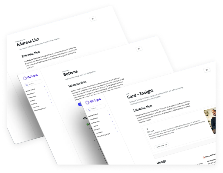
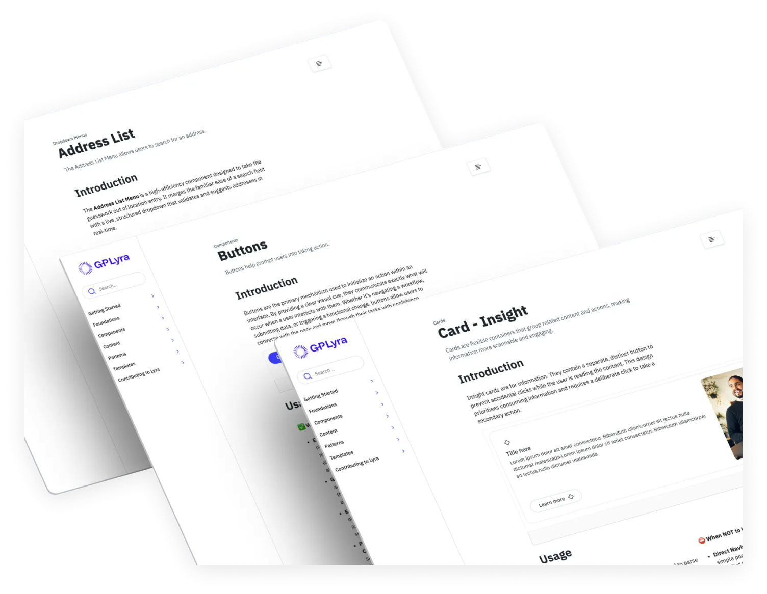
To eliminate fragmentation, I introduced the "Context Block" a single-page architectural standard that consolidates a component's entire lifecycle into one continuous, logical flow
I prototyped and tested three distinct layout variations using the File Upload component as our primary test case. By prioritising immediate discovery, the winning Context Block design ensures users can scroll through a component’s entire story without ever leaving the page.
The Standardised Hierarchy:
- Introduction: High-level overview and the "What is it?" definition.
- Usage: Best practices and "When to use" logic.
- Do’s and Don’ts: Clear visual examples of correct and incorrect implementation.
- Props: Technical specifications and code properties for developers.
- States and Variations: Visualising component behaviour under different conditions.
- Accessibility: Guidelines for ensuring inclusive design.
- Related Components: Immediate links to alternative patterns to prevent dead ends.
Section 03: Execution & Rollout
Validating and Scaling the Truth
A design system is only as effective as its documentation. Internal research revealed that G-P team members had a strict "frustration ceiling": if they could not find an answer within two minutes, they abandoned the official documentation.
Section 04: Impact
Designing for Humans and Machines
By treating documentation speed as a primary product metric, the G-P Lyra system transitioned from a state of internal frustration to a high-performance tool.
- Breaking the Ceiling: The new architecture successfully reduced average search times from 2:49 down to 0:46, drastically improving team velocity and system adherence.
- Optimizing for AI Connectivity: The most impactful strategic decision was future-proofing the structure. By consolidating the component lifecycle into a coherent, single-page unit, the Context Block is now optimized for AI assistants to crawl efficiently—instantly linking strategic usage guidelines directly to technical code specifications.
Further work
Content Design in an Agentic Workflow

Systematizing the System: The G-P Lyra Context Block
My Role
Team
Timeline
Tools
Platform
UX Design Intern
Design
System
10 weeks
Figma, Story Book
Zero Height
TL;DR: I led a system-wide architectural realignment of G-P Lyra's documentation, replacing fragmented tabs with a unified "Context Block" single-page structure. This overhauled the discovery path for both designers and developers, dropping average search times from an obsolete 2:49 down to a gold-standard 0:46.
Section 01: The Problem
The Two-Minute Frustration Ceiling
A design system is only as effective as its documentation. Internal research revealed that G-P team members had a strict "frustration ceiling": if they could not find an answer within two minutes, they abandoned the official documentation.
The Baseline Failure: Task-based audits and a RAG (Red, Amber, Green) analysis of our existing documentation revealed mass inconsistency and information scarcity.
01
Tooltip
A tooltip briefly describes an interactive element on mouse hover or keyboard focus.
Examples
Code
Usage
Changelog
Default
Use the default tooltip to display brief, helpful information when a person hovers over a target element. The default tooltip will:
appear and disappear after a short delay.
•
remain visible if someone briefly moves their mouse off and back onto the target.
•
disappear immediately if someone hovers over or focuses on another element with a tooltip, or if they scroll the page.
•
Tooltip content will wrap at 240px to maintain readability.
Single line example
Multi-line example

Styles

Copy code

Edit in code sandbox

import React from 'react';
import Button from '@atlaskit/button/default/button';
import { Inline } from '@atlaskit/primitives/compiled';
import Tooltip from '@atlaskit/tooltip/Tooltip';
export default function TooltipDefaultExample(): React.JSX.Element {
return (
<Inline space="space.100">
<Tooltip content="This is a tooltip">
{(tooltipProps) => (
<Button appearance="primary" {...tooltipProps}>
Single line example
</Button>
)}
</Tooltip>
<Tooltip content="This is a tooltip with a longer message that will wrap at 240px to maintain readability.">
{(tooltipProps) => (
<Button appearance="primary" {...tooltipProps}>
Multi-line example
</Button>
)}
</Tooltip>
</Inline>
);
}
Show more

With keyboard shortcut
Use the
shortcut
prop to display a keyboard shortcut in the tooltip. Keys will be displayed as individual keyboard key segments below the tooltip content.
Keyboard shortcuts in tooltips are hidden from screen readers, so always provide them in another way, such as a panel or dialog. This ensures everyone can discover and use shortcuts, no matter how they navigate.
Single line example
Multi-line example

Styles

Copy code

Edit in code sandbox

import React from 'react';
import Button from '@atlaskit/button/default/button';
import { Inline } from '@atlaskit/primitives/compiled';
import Tooltip from '@atlaskit/tooltip/Tooltip';
export default function TooltipKeyboardShortcutExample(): React.JSX.Element {
return (
<Inline space="space.100">
<Tooltip content="This is a tooltip" shortcut={['Ctrl', '[']}>
{(tooltipProps) => (
<Button appearance="primary" {...tooltipProps}>
Single line example
</Button>
)}
</Tooltip>
<Tooltip
content="This is a tooltip with a longer message that will wrap at 240px to maintain readability."
shortcut={['Ctrl', '[']}
>
{(tooltipProps) => (
<Button appearance="primary" {...tooltipProps}>
Multi-line example
</Button>
)}
</Tooltip>
</Inline>
);
}
Show more

Positioning
Relative to target
Use the
position
prop to specify where the tooltip appears relative to its target:
top
,
right
,
left
, or
bottom
.
Set
position="auto"
so the tooltip automatically shows on the side with the most available space.
•
If you don’t set a position, the tooltip defaults to
bottom
.
•
If the preferred side would cause it to overflow the screen, the tooltip will automatically adjust its position.
•
top
top-start
top-end
bottom
bottom-start
bottom-end
right
right-start
right-end
left
left-start
left-end
auto
auto-start
auto-end

Styles

Copy code

Edit in code sandbox

import React from 'react';
import Button from '@atlaskit/button/default/button';
import { cssMap } from '@atlaskit/css';
import { placements } from '@atlaskit/popper/main';
import { Box } from '@atlaskit/primitives/compiled';
import { token } from '@atlaskit/tokens';
import Tooltip from '@atlaskit/tooltip/Tooltip';
const placementGridPositions = cssMap({
'top-start': {
gridColumn: 2,
gridRow: 1,
},
top: {
gridColumn: 3,
gridRow: 1,
},
'top-end': {
gridColumn: 4,
gridRow: 1,
},
'bottom-start': {
gridColumn: 2,
gridRow: 5,
},
bottom: {
gridColumn: 3,
gridRow: 5,
},
'bottom-end': {
gridColumn: 4,
gridRow: 5,
},
'right-start': {
gridColumn: 5,
gridRow: 2,
},
right: {
gridColumn: 5,
gridRow: 3,
},
'right-end': {
gridColumn: 5,
gridRow: 4,
},
'left-start': {
gridColumn: 1,
gridRow: 2,
},
left: {
gridColumn: 1,
gridRow: 3,
},
'left-end': {
gridColumn: 1,
gridRow: 4,
},
'auto-start': {
gridColumn: 3,
gridRow: 2,
},
auto: {
gridColumn: 3,
gridRow: 3,
},
'auto-end': {
gridColumn: 3,
gridRow: 4,
},
});
const buttonGridStyles = cssMap({
root: {
display: 'grid',
gap: token('space.100'),
gridTemplate: 'repeat(5, 1fr) / repeat(5, 1fr)',
justifyItems: 'stretch',
},
});
const PositionExample = (): React.JSX.Element => {
return (
<Box xcss={buttonGridStyles.root}>
{placements.map((placement) => (
<Box key={placement} xcss={placementGridPositions[placement]}>
<Tooltip position={placement} content={placement}>
{(tooltipProps) => (
<Button {...tooltipProps} shouldFitContainer>
{placement}
</Button>
)}
</Tooltip>
</Box>
))}
</Box>
);
};
export default PositionExample;
Show more

Relative to mouse pointer
Positioning the tooltip near the mouse pointer, rather than the target, is helpful in scenarios where the tooltip may be visually disconnected from where someone hovers.
Examples include hovering on large target areas, such as panel resizers, or when someone hovers on an element while zoomed in on part of the screen where the tooltip doesn’t show.
To display the tooltip next to the mouse pointer (instead of the target element), set
position="mouse"
.
•
Further adjust the tooltip’s placement relative to the mouse by using the
mousePosition
property.
•
For keyboard users, the tooltip will always appear below (
bottom
position) the target element by default.
•
Resize me! Hover or focus on the right edge

Styles

Copy code

Edit in code sandbox

import { type CSSProperties, useRef, useState } from 'react';
import { cssMap, jsx } from '@compiled/react';
import {
PanelSplitter,
PanelSplitterProvider,
type ResizeBounds,
} from '@atlaskit/navigation-system/layout/panel-splitter';
import { token } from '@atlaskit/tokens';
const widthVar = '--panel-width';
const resizingCssVar = '--panel-splitter-resizing';
const styles = cssMap({
root: {
width: `var(${resizingCssVar}, var(${widthVar}))`,
height: '200px',
position: 'relative',
backgroundColor: token('color.background.accent.gray.subtlest'),
borderInlineEnd: `${token('border.width')} solid ${token('color.border')}`,
paddingBlockStart: token('space.100'),
paddingInlineEnd: token('space.100'),
paddingBlockEnd: token('space.100'),
paddingInlineStart: token('space.100'),
},
});
function getResizeBounds(): ResizeBounds {
return { min: '150px', max: '400px' };
}
const PanelSplitterWithTooltipAndShortcut = (): JSX.Element => {
const panelSplitterParentRef = useRef<HTMLDivElement | null>(null);
const [width, setWidth] = useState(300);
return (
<div
ref={panelSplitterParentRef}
css={styles.root}
style={
{
[widthVar]: `${width}px`,
} as CSSProperties
}
>
Resize me! Hover or focus on the right edge
<br />
<PanelSplitterProvider
panelRef={panelSplitterParentRef}
panelWidth={width}
onCompleteResize={setWidth}
getResizeBounds={getResizeBounds}
resizingCssVar={resizingCssVar}
position="end"
shortcut={['Ctrl', '[']}
>
<PanelSplitter
label="Resize panel"
testId="panel-splitter"
tooltipContent="Collapse panel"
/>
</PanelSplitterProvider>
</div>
);
};
export default PanelSplitterWithTooltipAndShortcut;
Show more

Updating tooltip position
When the content of a tooltip changes due to lazy loading, its position isn't recalculated and the tooltip may become misaligned.
If you need the tooltip to recalculate its position, you can control this manually using the
update
callback provided to the
content
render prop.
Hover and wait — content updates after 2s
Not using the update callback

Styles

Copy code

Edit in code sandbox

import React, { type ReactNode, useEffect, useLayoutEffect, useState } from 'react';
import Button from '@atlaskit/button/default/button';
import { Inline } from '@atlaskit/primitives/compiled';
import Tooltip from '@atlaskit/tooltip/Tooltip';
/**
* Content updates after a timeout only (no click).
* Example was changed from click-to-toggle so that with top-layer (popover="hint"), testing
* doesn't trigger light-dismiss: clicking outside the tooltip closes it, which made the
* update example appear broken. Hover + wait for timeout avoids that.
*/
const CONTENT_UPDATE_DELAY_MS = 2000;
function TooltipContent({ update }: { update?: () => void }): ReactNode {
const [isLoading, setIsLoading] = useState(true);
useEffect(() => {
const id = setTimeout(() => {
setIsLoading(false);
}, CONTENT_UPDATE_DELAY_MS);
return () => clearTimeout(id);
}, []);
useLayoutEffect(() => {
update?.();
}, [isLoading, update]);
return isLoading ? 'Loading...' : 'I am a lazy loaded tooltip, with a lot of content';
}
export default function TooltipUpdateContentExample(): React.JSX.Element {
return (
<Inline space="space.100">
<Tooltip content={({ update }) => <TooltipContent update={update} />}>
{(tooltipProps) => (
<Button {...tooltipProps}>
Hover and wait — content updates after {CONTENT_UPDATE_DELAY_MS / 1000}s
</Button>
)}
</Tooltip>
<Tooltip content={() => <TooltipContent />}>
{(tooltipProps) => <Button {...tooltipProps}>Not using the update callback</Button>}
</Tooltip>
</Inline>
);
}
Show more

Conditional tooltips for truncation
A tooltip can be conditionally shown by leveraging the
canAppear
prop. Use when you want the tooltip to only show when the element content is truncated.
Tooltip shown on this item as it is concatenated
No tooltip shown as this item is not being concatenated

Styles

Copy code

Edit in code sandbox

import { useRef } from 'react';
import { jsx } from '@compiled/react';
import invariant from 'tiny-invariant';
import { cssMap, cx } from '@atlaskit/css';
import { Pressable, Stack, Text } from '@atlaskit/primitives/compiled';
import { token } from '@atlaskit/tokens';
import Tooltip from '@atlaskit/tooltip/Tooltip';
const styles = cssMap({
root: {
paddingBlockStart: token('space.100'),
paddingBlockEnd: token('space.100'),
paddingInlineStart: token('space.100'),
paddingInlineEnd: token('space.100'),
borderColor: token('color.border'),
borderRadius: token('radius.small'),
borderStyle: 'solid',
borderWidth: token('border.width'),
backgroundColor: token('elevation.surface'),
textAlign: 'start',
'&:hover': {
backgroundColor: token('elevation.surface.hovered'),
},
'&:active': {
backgroundColor: token('elevation.surface.pressed'),
},
},
});
const smallStyles = cssMap({
root: {
width: '200px',
},
});
const content = {
first: 'Tooltip shown on this item as it is concatenated',
second: 'No tooltip shown as this item is not being concatenated',
};
export default function Example(): JSX.Element {
const firstRef = useRef<HTMLElement | null>(null);
const secondRef = useRef<HTMLElement | null>(null);
return (
<Stack space="space.100">
<Tooltip
content={content.first}
// don't need a screen reader announcement as the
// tooltip content is the same as the items content
isScreenReaderAnnouncementDisabled
canAppear={() => {
const element = firstRef.current;
invariant(element);
// Only showing the tooltip for this item when
// the element has been clamped.
return element.scrollHeight > element.clientHeight;
}}
>
{(props) => (
<Pressable {...props} xcss={cx(styles.root, smallStyles.root)}>
<Text ref={firstRef} maxLines={1}>
{content.first}
</Text>
</Pressable>
)}
</Tooltip>
<Tooltip
content={content.second}
// don't need a screen reader announcement as the
// tooltip content is the same as the items content
canAppear={() => {
const element = secondRef.current;
invariant(element);
// Only showing the tooltip for this item when
// the element has been clamped.
return element.scrollHeight > element.clientHeight;
}}
>
{(props) => (
<Pressable {...props} xcss={styles.root}>
<Text ref={secondRef} maxLines={1}>
{content.second}
</Text>
</Pressable>
)}
</Tooltip>
</Stack>
);
}
Show more

Ignoring pointer events
In some cases, a tooltip can get in the way if it stays visible when you move your mouse over it, making it hard to interact with elements underneath or nearby.
To avoid this, set the
ignoreTooltipPointerEvents
prop to true. This makes the tooltip ignore mouse interactions, so users can easily interact with other elements on the page. This works by applying
pointer-events: none
to the tooltip.
Default tooltip
Hover me first
Hover me second
Tooltip ignoring pointer events
Hover me first
Hover me second

Styles

Copy code

Edit in code sandbox

import React from 'react';
import Button from '@atlaskit/button/default/button';
import { Inline, Stack } from '@atlaskit/primitives/compiled';
import Tooltip from '@atlaskit/tooltip/Tooltip';
export default function TooltipPreventInteractionsExample(): React.JSX.Element {
return (
<Stack space="space.100">
<Stack space="space.100">
<p>Default tooltip</p>
<Inline space="space.100">
<Tooltip content="This is a tooltip" position="right">
{(tooltipProps) => (
<Button appearance="primary" {...tooltipProps}>
Hover me first
</Button>
)}
</Tooltip>
<Button>Hover me second</Button>
</Inline>
</Stack>
<Stack space="space.100">
<p>Tooltip ignoring pointer events</p>
<Inline space="space.100">
<Tooltip content="This is a tooltip" position="right" ignoreTooltipPointerEvents>
{(tooltipProps) => (
<Button appearance="primary" {...tooltipProps}>
Hover me first
</Button>
)}
</Tooltip>
<Button>Hover me second</Button>
</Inline>
</Stack>
</Stack>
);
}
Show more

Customizing tooltip
Use the
component
prop to customize the look and feel of the tooltip. The
TooltipPrimitive
component can be used as a base.
Never put links or other interactive elements in tooltips. Tooltips are not accessible to keyboard navigation, so users cannot tab into or interact with these elements, making them inaccessible.
Hover or keyboard focus on me

Styles

Copy code

Edit in code sandbox

import { forwardRef } from 'react';
import Button from '@atlaskit/button/default/button';
import { cssMap, jsx } from '@atlaskit/css';
import { token } from '@atlaskit/tokens';
import Tooltip from '@atlaskit/tooltip/Tooltip';
import TooltipPrimitive, { type TooltipPrimitiveProps } from '@atlaskit/tooltip/TooltipPrimitive';
const styles = cssMap({
root: {
backgroundColor: token('elevation.surface'),
borderRadius: token('radius.small'),
boxShadow: token('elevation.shadow.overlay'),
color: token('color.text'),
maxHeight: '300px',
maxWidth: '300px',
paddingBlockStart: token('space.100'),
paddingBlockEnd: token('space.100'),
paddingInlineStart: token('space.150'),
paddingInlineEnd: token('space.150'),
},
});
const CustomTooltip: React.ForwardRefExoticComponent<
React.PropsWithoutRef<TooltipPrimitiveProps> & React.RefAttributes<HTMLDivElement>
> = forwardRef<HTMLDivElement, TooltipPrimitiveProps>(function CustomTooltip(
{ children, className, ...rest },
ref,
) {
return (
<TooltipPrimitive
{...rest}
// Manually passing on `className` so it gets merged correctly in the build output.
// The passed classname is mostly used for integration testing (`.Tooltip`)
className={className}
// "css" does not "exist" - it gets transformed into "className" by compiled
css={styles.root}
ref={ref}
>
{children}
</TooltipPrimitive>
);
});
export default function TooltipCustomizationExample(): JSX.Element {
return (
<Tooltip component={CustomTooltip} content="This is a customized tooltip">
{(tooltipProps) => <Button {...tooltipProps}>Hover or keyboard focus on me</Button>}
</Tooltip>
);
}
Show more

Accessibility
Screen reader support
To make tooltip content accessible to screen readers, the tooltip component creates a hidden element containing the tooltip’s content. The tooltip trigger (the child of
<Tooltip>
) receives an
aria-describedby
attribute that links it to this hidden element.
If
content
is a function:
aria-describedby
is provided as a prop.
•
If
content
is a component:
aria-describedby
is added to the element in a
useEffect
.
•
To prevent the hidden element from being used for screen reader announcements, set the
isScreenReaderAnnouncementDisabled
prop. This is helpful when the tooltip content is the same as the trigger content, so no hidden element is needed.
Because keyboard shortcuts in tooltips are hidden from assistive technologies, always provide them in another way, such as in a panel or dialog. This ensures everyone can discover and use shortcuts, no matter how they navigate.
Never use the title attribute
Don’t use the HTML
title
attribute on any children of the tooltip component. Using
title
can cause double tooltips to appear and creates accessibility issues. The
title
attribute is not reliably supported by screen readers, and it is inaccessible to keyboard-only and mobile users.
Hover to reveal my tooltip and title attribute

Styles

Copy code

Edit in code sandbox

import React from 'react';
import Button from '@atlaskit/button/default/button';
import Tooltip from '@atlaskit/tooltip/Tooltip';
export default (): React.JSX.Element => (
<Tooltip
content="Never use the title attribute. Double tooltips will be displayed."
position="right"
>
{(tooltipProps) => (
<Button
appearance="primary"
title="This is a native tooltip from the title attribute. Don't do this, it isn't accessible."
{...tooltipProps}
>
Hover to reveal my tooltip and title attribute
</Button>
)}
</Tooltip>
);
Show more

Never put tooltips on disabled elements
Tooltips should only appear on interactive elements. Disabled elements can’t be reached by all devices or assistive technologies, making their tooltips inaccessible.
Tooltips on disabled elements can also confuse users, disrupt navigation, and are difficult to use on touch devices or with zoom magnification. People may not expect to find information by hovering over disabled or non-interactive elements.
See button guidance for information on avoiding disabled buttons.
Contents
Default
With keyboard shortcut
Positioning
Relative to target
Relative to mouse pointer
Updating tooltip position
Conditional tooltips for truncation
Ignoring pointer events
Customizing tooltip
Accessibility
Screen reader support
Never use the title attribute
Never put tooltips on disabled elements
Was this page helpful?
Yes
No
We use this feedback to improve our documentation.
The Cost of Fragmentation: The old layout split information across multiple fragmented tabs, requiring heavy cognitive load just to bridge the gap between "how it looks" (design) and "how it works" (engineering).
02
2:49
The Reality: The average time to task completion was 2:49—well past the abandonment threshold, leading directly to "visual trust erosion," inconsistent design implementations, and technical debt.
Section 02: The Core Solution
The Context Block Architecture
To eliminate fragmentation, I introduced the "Context Block" a single-page architectural standard that consolidates a component's entire lifecycle into one continuous, logical flow
I prototyped and tested three distinct layout variations using the File Upload component as our primary test case. By prioritising immediate discovery, the winning Context Block design ensures users can scroll through a component’s entire story without ever leaving the page.
The Standardised Hierarchy:
- Introduction: High-level overview and the "What is it?" definition.
- Usage: Best practices and "When to use" logic.
- Do’s and Don’ts: Clear visual examples of correct and incorrect implementation.
- Props: Technical specifications and code properties for developers.
- States and Variations: Visualising component behaviour under different conditions.
- Accessibility: Guidelines for ensuring inclusive design.
- Related Components: Immediate links to alternative patterns to prevent dead ends.
Section 03: Execution & Rollout
Validating and Scaling the Truth
This was not a visual refresh; it was a deep technical migration within ZeroHeight. I collaborated closely with Senior Product Managers and the Engineering team to ensure the new architecture met strict technical requirements alongside design usability.
Armed with the testing data comparing our 2:49 baseline to the 0:43 industry gold standard, I secured stakeholder buy-in to initiate a system-wide rollout. I audited, restructured, and rewrote the documentation for every component in the G-P Lyra ecosystem, meticulously mapping prop tables, live code previews, and design tokens into the new unified framework.
Section 04: Impact
Designing for Humans and Machines
By treating documentation speed as a primary product metric, the G-P Lyra system transitioned from a state of internal frustration to a high-performance tool.
- Breaking the Ceiling: The new architecture successfully reduced average search times from 2:49 down to 0:46, drastically improving team velocity and system adherence.
- Optimizing for AI Connectivity: The most impactful strategic decision was future-proofing the structure. By consolidating the component lifecycle into a coherent, single-page unit, the Context Block is now optimized for AI assistants to crawl efficiently—instantly linking strategic usage guidelines directly to technical code specifications.
Further work
Content Design in an Agentic Workflow
Systematizing the System: The G-P Lyra Context Block
My Role
Team
Timeline
Tools
Platform
UX Design Intern
Design
System
10 weeks
Figma, Story Book
Zero Height
TL;DR: I led a system-wide architectural realignment of G-P Lyra's documentation, replacing fragmented tabs with a unified "Context Block" single-page structure. This overhauled the discovery path for both designers and developers, dropping average search times from an obsolete 2:49 down to a gold-standard 0:46.
Section 01: The Problem
The Two-Minute Frustration Ceiling
A design system is only as effective as its documentation. Internal research revealed that G-P team members had a strict "frustration ceiling": if they could not find an answer within two minutes, they abandoned the official documentation.
- The Baseline Failure: Task-based audits and a RAG (Red, Amber, Green) analysis of our existing documentation revealed mass inconsistency and information scarcity.
- The Cost of Fragmentation: The old layout split information across multiple fragmented tabs, requiring heavy cognitive load just to bridge the gap between "how it looks" (design) and "how it works" (engineering).
- The Reality: The average time to task completion was 2:49—well past the abandonment threshold, leading directly to "visual trust erosion," inconsistent design implementations, and technical debt.
Tooltip
A tooltip briefly describes an interactive element on mouse hover or keyboard focus.
Examples
Code
Usage
Changelog
Default
Use the default tooltip to display brief, helpful information when a person hovers over a target element. The default tooltip will:
appear and disappear after a short delay.
•
remain visible if someone briefly moves their mouse off and back onto the target.
•
disappear immediately if someone hovers over or focuses on another element with a tooltip, or if they scroll the page.
•
Tooltip content will wrap at 240px to maintain readability.
Single line example
Multi-line example
Styles
Copy code
Edit in code sandbox
import React from 'react';
import Button from '@atlaskit/button/default/button';
import { Inline } from '@atlaskit/primitives/compiled';
import Tooltip from '@atlaskit/tooltip/Tooltip';
export default function TooltipDefaultExample(): React.JSX.Element {
return (
<Inline space="space.100">
<Tooltip content="This is a tooltip">
{(tooltipProps) => (
<Button appearance="primary" {...tooltipProps}>
Single line example
</Button>
)}
</Tooltip>
<Tooltip content="This is a tooltip with a longer message that will wrap at 240px to maintain readability.">
{(tooltipProps) => (
<Button appearance="primary" {...tooltipProps}>
Multi-line example
</Button>
)}
</Tooltip>
</Inline>
);
}
Show more
With keyboard shortcut
Use the
shortcut
prop to display a keyboard shortcut in the tooltip. Keys will be displayed as individual keyboard key segments below the tooltip content.
Keyboard shortcuts in tooltips are hidden from screen readers, so always provide them in another way, such as a panel or dialog. This ensures everyone can discover and use shortcuts, no matter how they navigate.
Single line example
Multi-line example
Styles
Copy code
Edit in code sandbox
import React from 'react';
import Button from '@atlaskit/button/default/button';
import { Inline } from '@atlaskit/primitives/compiled';
import Tooltip from '@atlaskit/tooltip/Tooltip';
export default function TooltipKeyboardShortcutExample(): React.JSX.Element {
return (
<Inline space="space.100">
<Tooltip content="This is a tooltip" shortcut={['Ctrl', '[']}>
{(tooltipProps) => (
<Button appearance="primary" {...tooltipProps}>
Single line example
</Button>
)}
</Tooltip>
<Tooltip
content="This is a tooltip with a longer message that will wrap at 240px to maintain readability."
shortcut={['Ctrl', '[']}
>
{(tooltipProps) => (
<Button appearance="primary" {...tooltipProps}>
Multi-line example
</Button>
)}
</Tooltip>
</Inline>
);
}
Show more
Positioning
Relative to target
Use the
position
prop to specify where the tooltip appears relative to its target:
top
,
right
,
left
, or
bottom
.
Set
position="auto"
so the tooltip automatically shows on the side with the most available space.
•
If you don’t set a position, the tooltip defaults to
bottom
.
•
If the preferred side would cause it to overflow the screen, the tooltip will automatically adjust its position.
•
top
top-start
top-end
bottom
bottom-start
bottom-end
right
right-start
right-end
left
left-start
left-end
auto
auto-start
auto-end
Styles
Copy code
Edit in code sandbox
import React from 'react';
import Button from '@atlaskit/button/default/button';
import { cssMap } from '@atlaskit/css';
import { placements } from '@atlaskit/popper/main';
import { Box } from '@atlaskit/primitives/compiled';
import { token } from '@atlaskit/tokens';
import Tooltip from '@atlaskit/tooltip/Tooltip';
const placementGridPositions = cssMap({
'top-start': {
gridColumn: 2,
gridRow: 1,
},
top: {
gridColumn: 3,
gridRow: 1,
},
'top-end': {
gridColumn: 4,
gridRow: 1,
},
'bottom-start': {
gridColumn: 2,
gridRow: 5,
},
bottom: {
gridColumn: 3,
gridRow: 5,
},
'bottom-end': {
gridColumn: 4,
gridRow: 5,
},
'right-start': {
gridColumn: 5,
gridRow: 2,
},
right: {
gridColumn: 5,
gridRow: 3,
},
'right-end': {
gridColumn: 5,
gridRow: 4,
},
'left-start': {
gridColumn: 1,
gridRow: 2,
},
left: {
gridColumn: 1,
gridRow: 3,
},
'left-end': {
gridColumn: 1,
gridRow: 4,
},
'auto-start': {
gridColumn: 3,
gridRow: 2,
},
auto: {
gridColumn: 3,
gridRow: 3,
},
'auto-end': {
gridColumn: 3,
gridRow: 4,
},
});
const buttonGridStyles = cssMap({
root: {
display: 'grid',
gap: token('space.100'),
gridTemplate: 'repeat(5, 1fr) / repeat(5, 1fr)',
justifyItems: 'stretch',
},
});
const PositionExample = (): React.JSX.Element => {
return (
<Box xcss={buttonGridStyles.root}>
{placements.map((placement) => (
<Box key={placement} xcss={placementGridPositions[placement]}>
<Tooltip position={placement} content={placement}>
{(tooltipProps) => (
<Button {...tooltipProps} shouldFitContainer>
{placement}
</Button>
)}
</Tooltip>
</Box>
))}
</Box>
);
};
export default PositionExample;
Show more
Relative to mouse pointer
Positioning the tooltip near the mouse pointer, rather than the target, is helpful in scenarios where the tooltip may be visually disconnected from where someone hovers.
Examples include hovering on large target areas, such as panel resizers, or when someone hovers on an element while zoomed in on part of the screen where the tooltip doesn’t show.
To display the tooltip next to the mouse pointer (instead of the target element), set
position="mouse"
.
•
Further adjust the tooltip’s placement relative to the mouse by using the
mousePosition
property.
•
For keyboard users, the tooltip will always appear below (
bottom
position) the target element by default.
•
Resize me! Hover or focus on the right edge
Styles
Copy code
Edit in code sandbox
import { type CSSProperties, useRef, useState } from 'react';
import { cssMap, jsx } from '@compiled/react';
import {
PanelSplitter,
PanelSplitterProvider,
type ResizeBounds,
} from '@atlaskit/navigation-system/layout/panel-splitter';
import { token } from '@atlaskit/tokens';
const widthVar = '--panel-width';
const resizingCssVar = '--panel-splitter-resizing';
const styles = cssMap({
root: {
width: `var(${resizingCssVar}, var(${widthVar}))`,
height: '200px',
position: 'relative',
backgroundColor: token('color.background.accent.gray.subtlest'),
borderInlineEnd: `${token('border.width')} solid ${token('color.border')}`,
paddingBlockStart: token('space.100'),
paddingInlineEnd: token('space.100'),
paddingBlockEnd: token('space.100'),
paddingInlineStart: token('space.100'),
},
});
function getResizeBounds(): ResizeBounds {
return { min: '150px', max: '400px' };
}
const PanelSplitterWithTooltipAndShortcut = (): JSX.Element => {
const panelSplitterParentRef = useRef<HTMLDivElement | null>(null);
const [width, setWidth] = useState(300);
return (
<div
ref={panelSplitterParentRef}
css={styles.root}
style={
{
[widthVar]: `${width}px`,
} as CSSProperties
}
>
Resize me! Hover or focus on the right edge
<br />
<PanelSplitterProvider
panelRef={panelSplitterParentRef}
panelWidth={width}
onCompleteResize={setWidth}
getResizeBounds={getResizeBounds}
resizingCssVar={resizingCssVar}
position="end"
shortcut={['Ctrl', '[']}
>
<PanelSplitter
label="Resize panel"
testId="panel-splitter"
tooltipContent="Collapse panel"
/>
</PanelSplitterProvider>
</div>
);
};
export default PanelSplitterWithTooltipAndShortcut;
Show more
Updating tooltip position
When the content of a tooltip changes due to lazy loading, its position isn't recalculated and the tooltip may become misaligned.
If you need the tooltip to recalculate its position, you can control this manually using the
update
callback provided to the
content
render prop.
Hover and wait — content updates after 2s
Not using the update callback
Styles
Copy code
Edit in code sandbox
import React, { type ReactNode, useEffect, useLayoutEffect, useState } from 'react';
import Button from '@atlaskit/button/default/button';
import { Inline } from '@atlaskit/primitives/compiled';
import Tooltip from '@atlaskit/tooltip/Tooltip';
/**
* Content updates after a timeout only (no click).
* Example was changed from click-to-toggle so that with top-layer (popover="hint"), testing
* doesn't trigger light-dismiss: clicking outside the tooltip closes it, which made the
* update example appear broken. Hover + wait for timeout avoids that.
*/
const CONTENT_UPDATE_DELAY_MS = 2000;
function TooltipContent({ update }: { update?: () => void }): ReactNode {
const [isLoading, setIsLoading] = useState(true);
useEffect(() => {
const id = setTimeout(() => {
setIsLoading(false);
}, CONTENT_UPDATE_DELAY_MS);
return () => clearTimeout(id);
}, []);
useLayoutEffect(() => {
update?.();
}, [isLoading, update]);
return isLoading ? 'Loading...' : 'I am a lazy loaded tooltip, with a lot of content';
}
export default function TooltipUpdateContentExample(): React.JSX.Element {
return (
<Inline space="space.100">
<Tooltip content={({ update }) => <TooltipContent update={update} />}>
{(tooltipProps) => (
<Button {...tooltipProps}>
Hover and wait — content updates after {CONTENT_UPDATE_DELAY_MS / 1000}s
</Button>
)}
</Tooltip>
<Tooltip content={() => <TooltipContent />}>
{(tooltipProps) => <Button {...tooltipProps}>Not using the update callback</Button>}
</Tooltip>
</Inline>
);
}
Show more
Conditional tooltips for truncation
A tooltip can be conditionally shown by leveraging the
canAppear
prop. Use when you want the tooltip to only show when the element content is truncated.
Tooltip shown on this item as it is concatenated
No tooltip shown as this item is not being concatenated
Styles
Copy code
Edit in code sandbox
import { useRef } from 'react';
import { jsx } from '@compiled/react';
import invariant from 'tiny-invariant';
import { cssMap, cx } from '@atlaskit/css';
import { Pressable, Stack, Text } from '@atlaskit/primitives/compiled';
import { token } from '@atlaskit/tokens';
import Tooltip from '@atlaskit/tooltip/Tooltip';
const styles = cssMap({
root: {
paddingBlockStart: token('space.100'),
paddingBlockEnd: token('space.100'),
paddingInlineStart: token('space.100'),
paddingInlineEnd: token('space.100'),
borderColor: token('color.border'),
borderRadius: token('radius.small'),
borderStyle: 'solid',
borderWidth: token('border.width'),
backgroundColor: token('elevation.surface'),
textAlign: 'start',
'&:hover': {
backgroundColor: token('elevation.surface.hovered'),
},
'&:active': {
backgroundColor: token('elevation.surface.pressed'),
},
},
});
const smallStyles = cssMap({
root: {
width: '200px',
},
});
const content = {
first: 'Tooltip shown on this item as it is concatenated',
second: 'No tooltip shown as this item is not being concatenated',
};
export default function Example(): JSX.Element {
const firstRef = useRef<HTMLElement | null>(null);
const secondRef = useRef<HTMLElement | null>(null);
return (
<Stack space="space.100">
<Tooltip
content={content.first}
// don't need a screen reader announcement as the
// tooltip content is the same as the items content
isScreenReaderAnnouncementDisabled
canAppear={() => {
const element = firstRef.current;
invariant(element);
// Only showing the tooltip for this item when
// the element has been clamped.
return element.scrollHeight > element.clientHeight;
}}
>
{(props) => (
<Pressable {...props} xcss={cx(styles.root, smallStyles.root)}>
<Text ref={firstRef} maxLines={1}>
{content.first}
</Text>
</Pressable>
)}
</Tooltip>
<Tooltip
content={content.second}
// don't need a screen reader announcement as the
// tooltip content is the same as the items content
canAppear={() => {
const element = secondRef.current;
invariant(element);
// Only showing the tooltip for this item when
// the element has been clamped.
return element.scrollHeight > element.clientHeight;
}}
>
{(props) => (
<Pressable {...props} xcss={styles.root}>
<Text ref={secondRef} maxLines={1}>
{content.second}
</Text>
</Pressable>
)}
</Tooltip>
</Stack>
);
}
Show more
Ignoring pointer events
In some cases, a tooltip can get in the way if it stays visible when you move your mouse over it, making it hard to interact with elements underneath or nearby.
To avoid this, set the
ignoreTooltipPointerEvents
prop to true. This makes the tooltip ignore mouse interactions, so users can easily interact with other elements on the page. This works by applying
pointer-events: none
to the tooltip.
Default tooltip
Hover me first
Hover me second
Tooltip ignoring pointer events
Hover me first
Hover me second
Styles
Copy code
Edit in code sandbox
import React from 'react';
import Button from '@atlaskit/button/default/button';
import { Inline, Stack } from '@atlaskit/primitives/compiled';
import Tooltip from '@atlaskit/tooltip/Tooltip';
export default function TooltipPreventInteractionsExample(): React.JSX.Element {
return (
<Stack space="space.100">
<Stack space="space.100">
<p>Default tooltip</p>
<Inline space="space.100">
<Tooltip content="This is a tooltip" position="right">
{(tooltipProps) => (
<Button appearance="primary" {...tooltipProps}>
Hover me first
</Button>
)}
</Tooltip>
<Button>Hover me second</Button>
</Inline>
</Stack>
<Stack space="space.100">
<p>Tooltip ignoring pointer events</p>
<Inline space="space.100">
<Tooltip content="This is a tooltip" position="right" ignoreTooltipPointerEvents>
{(tooltipProps) => (
<Button appearance="primary" {...tooltipProps}>
Hover me first
</Button>
)}
</Tooltip>
<Button>Hover me second</Button>
</Inline>
</Stack>
</Stack>
);
}
Show more
Customizing tooltip
Use the
component
prop to customize the look and feel of the tooltip. The
TooltipPrimitive
component can be used as a base.
Never put links or other interactive elements in tooltips. Tooltips are not accessible to keyboard navigation, so users cannot tab into or interact with these elements, making them inaccessible.
Hover or keyboard focus on me
Styles
Copy code
Edit in code sandbox
import { forwardRef } from 'react';
import Button from '@atlaskit/button/default/button';
import { cssMap, jsx } from '@atlaskit/css';
import { token } from '@atlaskit/tokens';
import Tooltip from '@atlaskit/tooltip/Tooltip';
import TooltipPrimitive, { type TooltipPrimitiveProps } from '@atlaskit/tooltip/TooltipPrimitive';
const styles = cssMap({
root: {
backgroundColor: token('elevation.surface'),
borderRadius: token('radius.small'),
boxShadow: token('elevation.shadow.overlay'),
color: token('color.text'),
maxHeight: '300px',
maxWidth: '300px',
paddingBlockStart: token('space.100'),
paddingBlockEnd: token('space.100'),
paddingInlineStart: token('space.150'),
paddingInlineEnd: token('space.150'),
},
});
const CustomTooltip: React.ForwardRefExoticComponent<
React.PropsWithoutRef<TooltipPrimitiveProps> & React.RefAttributes<HTMLDivElement>
> = forwardRef<HTMLDivElement, TooltipPrimitiveProps>(function CustomTooltip(
{ children, className, ...rest },
ref,
) {
return (
<TooltipPrimitive
{...rest}
// Manually passing on `className` so it gets merged correctly in the build output.
// The passed classname is mostly used for integration testing (`.Tooltip`)
className={className}
// "css" does not "exist" - it gets transformed into "className" by compiled
css={styles.root}
ref={ref}
>
{children}
</TooltipPrimitive>
);
});
export default function TooltipCustomizationExample(): JSX.Element {
return (
<Tooltip component={CustomTooltip} content="This is a customized tooltip">
{(tooltipProps) => <Button {...tooltipProps}>Hover or keyboard focus on me</Button>}
</Tooltip>
);
}
Show more
Accessibility
Screen reader support
To make tooltip content accessible to screen readers, the tooltip component creates a hidden element containing the tooltip’s content. The tooltip trigger (the child of
<Tooltip>
) receives an
aria-describedby
attribute that links it to this hidden element.
If
content
is a function:
aria-describedby
is provided as a prop.
•
If
content
is a component:
aria-describedby
is added to the element in a
useEffect
.
•
To prevent the hidden element from being used for screen reader announcements, set the
isScreenReaderAnnouncementDisabled
prop. This is helpful when the tooltip content is the same as the trigger content, so no hidden element is needed.
Because keyboard shortcuts in tooltips are hidden from assistive technologies, always provide them in another way, such as in a panel or dialog. This ensures everyone can discover and use shortcuts, no matter how they navigate.
Never use the title attribute
Don’t use the HTML
title
attribute on any children of the tooltip component. Using
title
can cause double tooltips to appear and creates accessibility issues. The
title
attribute is not reliably supported by screen readers, and it is inaccessible to keyboard-only and mobile users.
Hover to reveal my tooltip and title attribute
Styles
Copy code
Edit in code sandbox
import React from 'react';
import Button from '@atlaskit/button/default/button';
import Tooltip from '@atlaskit/tooltip/Tooltip';
export default (): React.JSX.Element => (
<Tooltip
content="Never use the title attribute. Double tooltips will be displayed."
position="right"
>
{(tooltipProps) => (
<Button
appearance="primary"
title="This is a native tooltip from the title attribute. Don't do this, it isn't accessible."
{...tooltipProps}
>
Hover to reveal my tooltip and title attribute
</Button>
)}
</Tooltip>
);
Show more
Never put tooltips on disabled elements
Tooltips should only appear on interactive elements. Disabled elements can’t be reached by all devices or assistive technologies, making their tooltips inaccessible.
Tooltips on disabled elements can also confuse users, disrupt navigation, and are difficult to use on touch devices or with zoom magnification. People may not expect to find information by hovering over disabled or non-interactive elements.
See button guidance for information on avoiding disabled buttons.
Contents
Default
With keyboard shortcut
Positioning
Relative to target
Relative to mouse pointer
Updating tooltip position
Conditional tooltips for truncation
Ignoring pointer events
Customizing tooltip
Accessibility
Screen reader support
Never use the title attribute
Never put tooltips on disabled elements
Was this page helpful?
Yes
No
We use this feedback to improve our documentation.
2:49
Section 02: The Core Solution
The Context Block Architecture
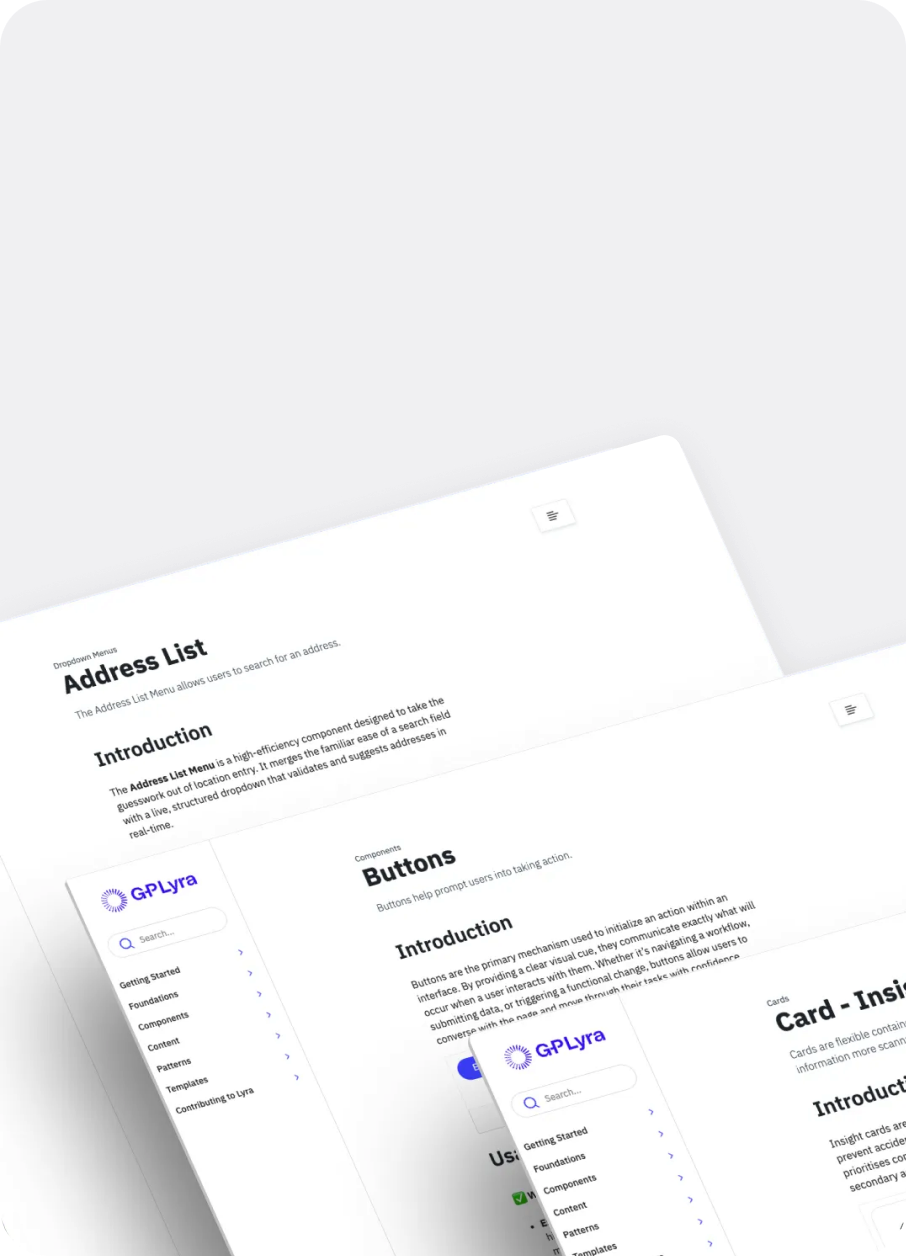
To eliminate fragmentation, I introduced the "Context Block" a single-page architectural standard that consolidates a component's entire lifecycle into one continuous, logical flow
I prototyped and tested three distinct layout variations using the File Upload component as our primary test case. By prioritising immediate discovery, the winning Context Block design ensures users can scroll through a component’s entire story without ever leaving the page.
The Standardised Hierarchy:
- Introduction: High-level overview and the "What is it?" definition.
- Usage: Best practices and "When to use" logic.
- Do’s and Don’ts: Clear visual examples of correct and incorrect implementation.
- Props: Technical specifications and code properties for developers.
- States and Variations: Visualising component behaviour under different conditions.
- Accessibility: Guidelines for ensuring inclusive design.
- Related Components: Immediate links to alternative patterns to prevent dead ends.
Section 03: Execution & Rollout
Validating and Scaling the Truth
This was not a visual refresh; it was a deep technical migration within ZeroHeight. I collaborated closely with Senior Product Managers and the Engineering team to ensure the new architecture met strict technical requirements alongside design usability.
Armed with the testing data comparing our 2:49 baseline to the 0:43 industry gold standard, I secured stakeholder buy-in to initiate a system-wide rollout. I audited, restructured, and rewrote the documentation for every component in the G-P Lyra ecosystem, meticulously mapping prop tables, live code previews, and design tokens into the new unified framework.
Section 04: Impact
Designing for Humans and Machines
By treating documentation speed as a primary product metric, the G-P Lyra system transitioned from a state of internal frustration to a high-performance tool.
- Breaking the Ceiling: The new architecture successfully reduced average search times from 2:49 down to 0:46, drastically improving team velocity and system adherence.
- Optimizing for AI Connectivity: The most impactful strategic decision was future-proofing the structure. By consolidating the component lifecycle into a coherent, single-page unit, the Context Block is now optimized for AI assistants to crawl efficiently—instantly linking strategic usage guidelines directly to technical code specifications.
Further work
Content Design in an Agentic Workflow