Nov 2025 - Feb 2026
G-P Lyra
Figma, Zero-Height

My Work
The Single Source
The Foundation of G-P Lyra
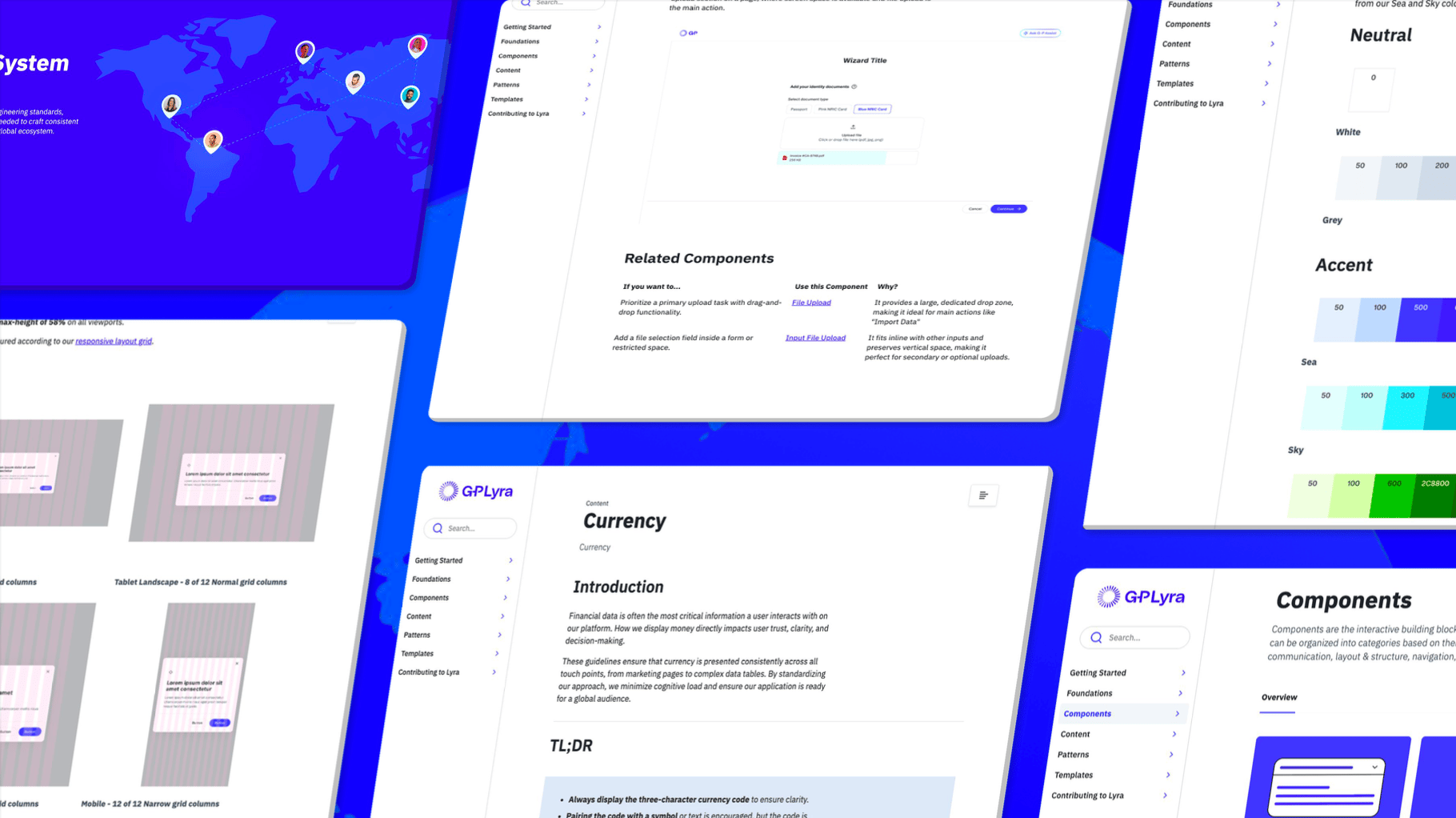
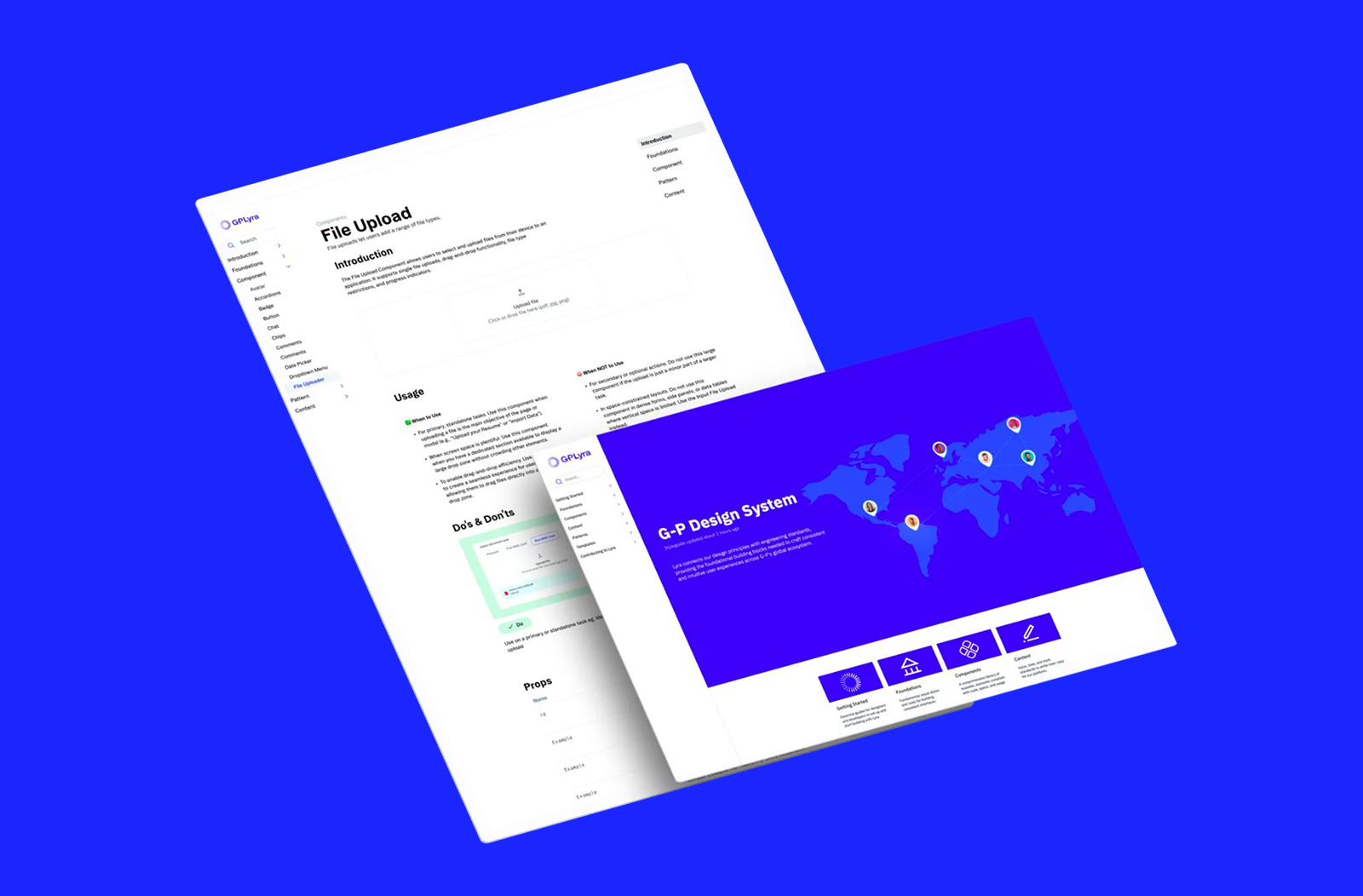
G-P Lyra is the design system powering Globalization Partners, designed to create cohesion across a complex global platform. For this project, I focused on a comprehensive realignment of our documentation within ZeroHeight, specifically using the File Upload component as a blueprint for a new architectural standard.
Standardising Component Documentation
The goal was to move beyond basic component libraries and create a robust set of documents that serve as a primary resource for both designers and developers. This involved auditing every element of the system to ensure that our technical specifications, usage guidelines, and visual assets were synchronised and accessible.
Mission
Breaking the Frustration Ceiling
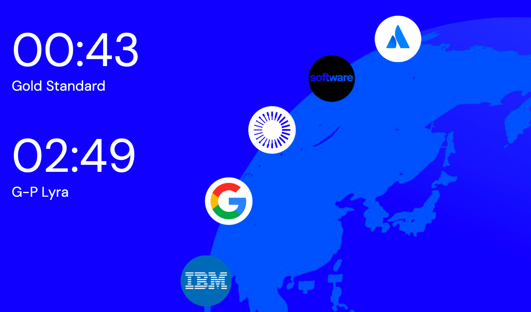
My primary mission was to reduce the friction teams felt when interacting with our documentation. Internal research indicated that team members reached a critical "frustration ceiling" at the two-minute mark when searching for information. If they could not find an answer within that window, they would abandon the official documentation, leading to inconsistent designs and technical debt.
Creating a Unified Truth
I aimed to transform G-P Lyra into a single source of truth. By eliminating fragmented information and "visual trust erosion," I wanted to ensure that every designer and engineer felt confident that the documentation they were looking at was current, accurate, and easy to navigate.
Sam Malone
Solo Designer
Solution
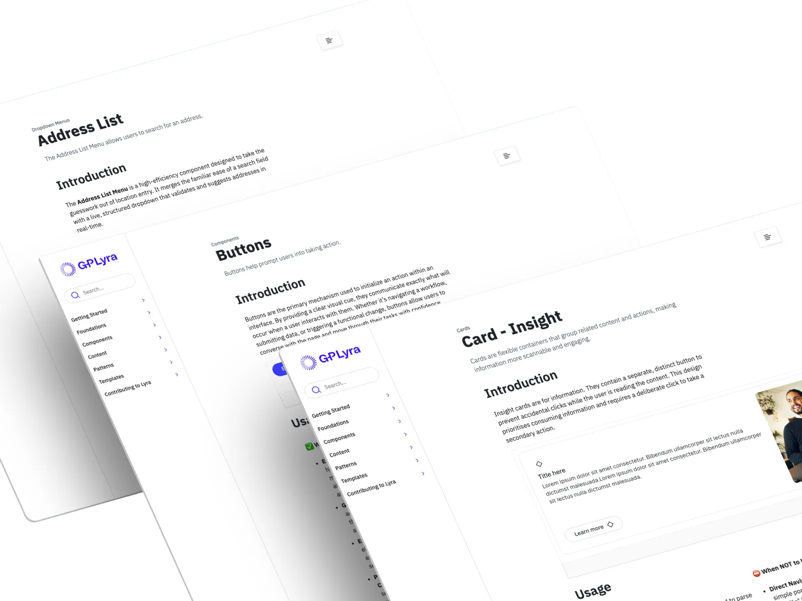
The Context Block Architecture
The core of my solution was the introduction of the "Context Block." Traditionally, documentation was split across multiple fragmented tabs, which forced users to click back and forth to find related information. I replaced this with a single-page architecture that allows for a continuous, logical flow of information.
Optimising for the Future
This streamlined layout was not just about human readability but also about future-proofing. By consolidating the component lifecycle into a coherent unit, the architecture is now optimised for AI connectivity. This allows AI assistants to crawl the documentation efficiently, instantly linking strategic usage guidelines to technical code specifications.
Flows
Navigational Efficiency
I mapped out the user journey for two primary personas: the designer looking for usage constraints and the developer looking for implementation props. The old flow required multiple clicks and cognitive load to bridge the gap between "how it looks" and "how it works."
Streamlining the Discovery Path
The new flow prioritises immediate discovery. By placing the "Context Block" at the heart of the navigation, I ensured that a user could scroll through a component’s entire story, from high-level introduction to granular prop tables, without ever leaving the page. This direct path significantly reduces the time to task completion.
Research
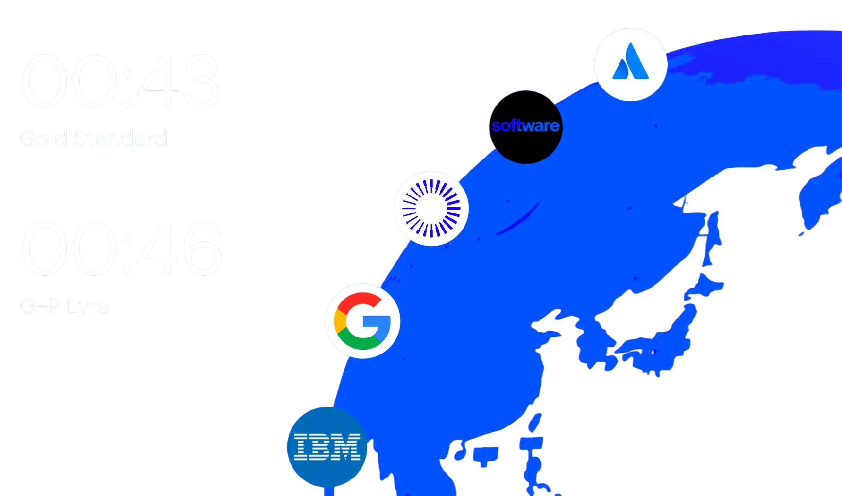
Benchmarking and RAG Analysis
The project began with task based audits against gold standard systems to establish our target of 0:43. I also conducted a RAG (Red, Amber, Green) analysis of our existing documentation, which revealed mass inconsistency and information scarcity across the platform.
Quantifying Abandonment
The research confirmed that our former state of 2:49 was a failure of the system. Because this exceeded the two minute frustration ceiling, the documentation was essentially obsolete for many users. This data provided the evidence needed to move toward a radical structural overhaul.
Decisions
Key Insights:
Breaking the Two Minute Ceiling
We reduced search times to 0:46 to prevent users from hitting the two minute frustration ceiling and defaulting to human sources for answers.
Unified Context Block Strategy
Replacing fragmented tabs with a single page Context Block eliminated cognitive load and prepared the documentation for future AI connectivity.
Cross Component Connectivity
The introduction of Related Components ensures users never reach a dead end by providing immediate links to alternative design patterns.
Validating the Single Source of Truth
To determine the most effective documentation structure, I developed and tested three distinct layout variations with our primary users. I used the File Upload component as the test case to see which format best solved the information retrieval issues. This testing was not done in isolation; I collaborated closely with Senior Product Managers and the Engineering team to ensure the final direction met both strategic and technical requirements.
Collaborative Stakeholder Alignment
Liaising with senior stakeholders was critical to ensure that a radical shift in documentation would be supported across the organisation. By presenting the testing data and the performance gap between our current state and the 0:43 gold standard, I gained the necessary buy-in to move forward with a single page, single source of truth model. Once this decision was finalised, I spearheaded the transition for the entire documentation library.
Hierarchy of the New Context Block
The new hierarchy was designed to follow a logical progression, ensuring that the most frequently searched information was accessible within seconds. Each component page now follows this standard structure:
- Introduction: High level overview and the "What is it?" for the component.
- Usage: Best practices and the "When to use" logic.
- Do’s and Don’ts: Clear visual examples of correct and incorrect implementation.
- Props: Technical specifications and code properties for developers.
- States and Variations: Visualising how the component behaves under different conditions.
- Accessibility: Guidelines for ensuring inclusive design.
- Related Components: Links to alternative patterns within the ecosystem.
Documentation Realignment
From Prototype to Production
While initial layout concepts were validated in Figma, the core of this project was a full-scale live implementation within ZeroHeight. This was not merely a visual refresh but a total structural realignment of the G-P Lyra documentation library. I moved beyond static prototyping to execute a comprehensive migration, transitioning our entire component ecosystem into the new single-page architecture.
Executing the System-Wide Rollout
The implementation phase involved a meticulous overhaul of the existing information architecture. I spearheaded the transition by auditing, restructuring, and rewriting the documentation for every component in the system to align with the new "Context Block" standard. This process required deep technical coordination to ensure that prop tables, live code previews, and design tokens were accurately mapped within the new framework.
Standardising the Global Library
The result of this long-form realignment was a fully operational, high-performance documentation site. By rolling out this structure across the entire platform, I eliminated the fragmented user experience and replaced it with a unified, predictable environment. This systemic rollout was the final step in bridging the performance gap, moving the platform from a state of frustration to a professional tool that rivals industry gold standards.
Reflection
A Data-Driven Transformation
This project taught me that the "user" of a design system requires speed above all else. By understanding the two minute frustration ceiling, I learned how to prioritise information based on urgency. Bringing G-P Lyra in line with industry benchmarks has significantly improved our team velocity, reducing search times from 2:49 to 0:46.
The Power of Architecture
Looking back, the move toward an AI-ready architecture was the most impactful decision of the project. Building a unified source of truth that is both human-readable and machine-readable is essential for modern design systems. This experience has deepened my understanding of how design architecture directly impacts product quality and developer experience.